
<script type='text/javascript'> var divElement = document.getElementById('viz1615526899023'); var vizElement = divElement.getElementsByTagName('object')[0]; vizElement.style.width='1016px';vizElement.style.height='991px'; var scriptElement = document.createElement('script'); scriptElement.src = 'https://public.tableau.com/javascripts/api/viz_v1.js'; vizElement.parentNode.insertBefore(scriptElement, vizElement); </script>My stacked bar graph visualizes the occupations of Albany residents, as well as their race. I went with this type of graph because I thought it was very interesting that the majority of the black population held jobs in labor or domestic work, with very little attending school or holding public service jobs. I played around with the colors, in hopes that the minority would be represented better. I chose grey to represent the white population in hopes that a dull color would allow for the small population of minorities to be seen better.

<script type='text/javascript'> var divElement = document.getElementById('viz1615527030033'); var vizElement = divElement.getElementsByTagName('object')[0]; vizElement.style.width='1016px';vizElement.style.height='991px'; var scriptElement = document.createElement('script'); scriptElement.src = 'https://public.tableau.com/javascripts/api/viz_v1.js'; vizElement.parentNode.insertBefore(scriptElement, vizElement); </script>My pie chart, although it looks very aggressive, is demonstrating the various occupations held by male and females. The point of this was to visually demonstrate the types of jobs that males and females held, and the differences between them. As you can see from the two charts above, males typically worked in labor, industry and trade-like jobs. On the female chart, you can see that they held jobs in domestic settings and office work. To me, this perfectly demonstrates the workforce and the gendered hierarchy of it, as well as the feminine/masculine associations with the stereotypical “male” and “female” jobs.
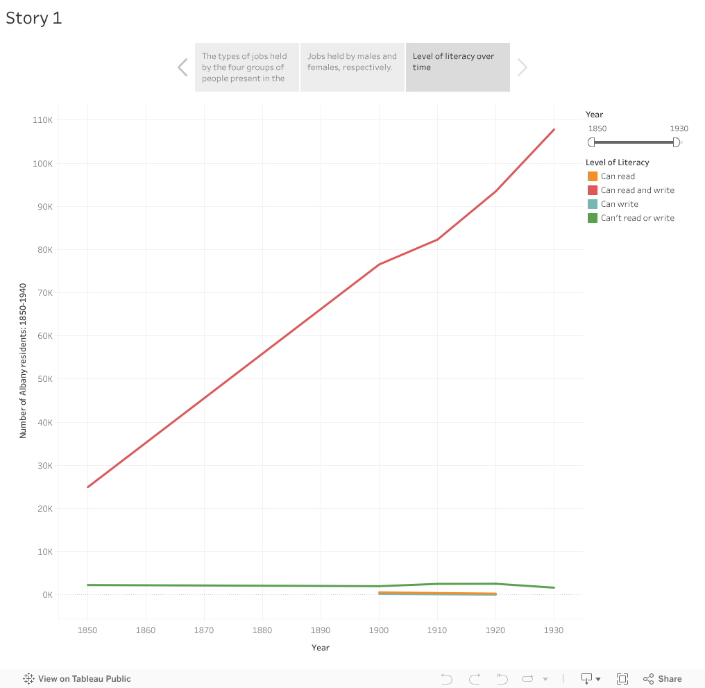
<script type='text/javascript'> var divElement = document.getElementById('viz1615527088953'); var vizElement = divElement.getElementsByTagName('object')[0]; vizElement.style.width='1016px';vizElement.style.height='991px'; var scriptElement = document.createElement('script'); scriptElement.src = 'https://public.tableau.com/javascripts/api/viz_v1.js'; vizElement.parentNode.insertBefore(scriptElement, vizElement); </script>My line graph visualizes the number of Albany residents and their level of literacy. My goal of this graph was to see how the level of literacy changed from 1850-1930. As you can see, the ability to read and write only increased. However, I would be curious to see the differences in race, as I can only assume that the white population had better opportunities to become more literate when compared to minorities.
After going through this assignment, I have a love/hate relationship with Tableau. I enjoyed looking at data in a visual way, and it really opened my eyes to just how many ways we can utilize visual representations. On the other hand, it was very time consuming, and at times, super frustrating. However, for students that learn better visually (like myself,) I think this is super beneficial, in both learning and teaching. Also, I particularly enjoyed the undo button! Similarly to my classmates, I felt much more comfortable with this type of software than I did coding.