So now what?
We can read data, fetch data, and extend data — so what do we do with it? In this module we’ll start working with data visualization and start thinking about what we can do with it.
This week we’ll:
- Understand the basics of reading different kinds of data visualization
- Learn the different modes of conveying information in data visualization
- Get introduced to Tableau Public visualization software
| Start | Meet | Post |
| Mar 8 | Mar 10 | Mar 12 |
Module Outline
- Module Outline
- Wednesday Agenda
- Tasks
- Reading
- Everyone
- Grad
- Watch
- Final Project
- Assignment: Intro to Tableau
Wednesday Agenda
At our Wednesday meeting, we will troubleshoot the Intro to Tableau assignment.
Discussion Starter
This week’s discussion starter video is on Blackboard under the title “Module 5: Using Data.”
Tasks
- Respond to the discussion starter video in the #module5 Slack channel
- Make a free account at Tableau Public. You will need this username/password to complete many assignments and access your work in the future. public.tableau.com is different than tableau.com!
- Download and install Tableau Public on your computer (this is free, and separate from making an account. Tableau Desktop and Tableau Pro are paid apps and not needed for this class!)
- Do the Intro to Tableau assignment below
- To finish the assignment, choose either Option A: Tableau or Option B: Observable (details below)
- Regardless of the option you choose, embed your Tableau workbook in a new post here on the course blog using the Module 5 Assignment category
If you get stuck on something, ask on Slack or check out others’ posts.
Reading
Everyone
This looks like a lot of reading this week, but each individual chapter is fairly short!
Basic vocabulary and orientation to reading different kinds of charts:
- Fundamentals of Data Visualization Ch 3.1, Cartesian Coordinates
- Disregard the rest of the chapter after 3.1
- Fundamentals of Data Visualization Ch 4, Color Scales
Understanding and reading different kinds of charts
- Fundamentals of Data Visualization Ch 6, Visualizing Amounts
- Fundamentals of Data Visualization Ch 7.1, Visualizing a Single Distribution
- Read only the section on single histograms. We will not be dealing with or making the other kinds of distribution charts in this chapter.
- Fundamentals of Data Visualization Ch 10, Visualizing Proportions
- Fundamentals of Data Visualization Ch 11, Visualizing Nested Proportions
- Disregard the final section on parallel sets, which we will not be making or using
- Fundamentals of Data Visualization Ch 12 Intro and 12.1, Visualizing Associations
- Disregard all sections of this chapter after 12.1
- Fundamentals of Data Visualization Ch 13, Visualizing Time Series
- Disregard the final section on “Time series of two or more variables”
Grad
- Data Visualization and the Modern Imagination read through all 6 exhibits
Watch: What is Dataviz
Assignment: Intro to Tableau
It will be helpful to view some of the Tableau intro videos before starting this assignment 1: Overview, 2: Connection to Excel and Text Files, 10: Joins and Unions, 11: Creating Your First Chart, 12: Using the Show Me Tool Bar, 13: Understanding the Logic of Charts, 14: Combining Sheets on a Dashboard, 15: Adding Interactivity, and 20: Publishing and Embedding will be most useful for our class. I strongly recommend watching 1: Overview, 11: Creating Your First Chart, and 20: Publishing at a minimum, which are about 15 minutes of video together. You can disregard Connecting to Web Data Connectors, Connecting to Spatial Files, Connecting to PDFs, all the Data Preparation videos (7-10), Designing for Mobile, and Edit on the Web.
For the Intro to Tableau assignment, download this file of Albany census data from 1850-1940. Create a new Tableau file and connect the census data. Make a new sheet for each of the chart types below, and make sure to rename the sheet with the corresponding chart name.
If you get stuck, you can view or download my examples here. If you need someone to look at your workbook, save it to your Tableau Public account and link to your where your workbook is saved in your online Tableau Public profile.
Save your work frequently. When you save, your work will be uploaded to your Tableau Public account. Make liberal use of the undo button (upper left in the interface)/Cmd-Z if you mess something up.
Update: Tableau for Mac and PC have some slight differences. The major one to watch out for is, if you’re on PC, your steps for creating a single year slider will be different than what I have documented here for Mac. To make a single year slider filter, you will need to drag year to the filter pane, then select all years when prompted. After selecting OK, you can right click > show filter and customize the filter as detailed below. If you do not select all years in your filter, the filter won’t be customizable to a slider.
Bar chart
- Make a simple bar chart by dragging Birthplace to Columns and Albany-Census to Rows.
- Sort the chart using the buttons in the toolbar or the icon that appears on hover over the y axis label.
- Remove New York from the chart by clicking New York > Exclude
- Create Birthplace groups by clicking Massachusetts, holding down Cmd (Mac) or Ctrl (PC), and clicking another US state. While hovering over one of the selected states, click the paperclip icon to group the states together.
- Group all the US states besides NY together, and use your judgement to group other countries in Birthplace. Leave Ireland, Germany, and Italy ungrouped. When you finish, you should have bars for Ireland, Germany, Italy, one for all US states, and six or fewer other bars. Use your judgement to choose how and what other countries to group.
- Resort the chart after you’re finished making your groups
Side-by-side Bar chart
- Create a bar chart with the grouped Birthplace dimension you created for the bar chart, and Albany-Census in Rows.
- Exclude NY
- Drag the grouped Birthplace dimension to Marks > Color to color your bars
- Drag Year into Columns in front of Birthplace to separate charts by year
- Sort the chart
Dot plot
- Create a side-by-side bar chart using the steps above
- Under Marks, select circle
- Swap rows and columns using the icon in the toolbar to create a horizontal chart
Heatmap
- Drag Year to Columns and the grouped Birthplace dimension to Rows.
- Drag Albany-Census to Marks > Color
- Exclude NY and Null Birthplace
- Sort by immigration in 1850 so that the largest group in 1850 is at the top of the chart
- Adjust the size of the color blocks by hovering over the divide between country names or years and dragging the small arrow bar that appears.
Line
- Drag Year to Columns and Birthplace (not the grouped one!) to Rows.
- Drag the grouped Birthplace dimension onto the Color card.
- Hovering over Birthplace in Rows, click the options triangle and change Birthplace to Measure > Count
- Exclude NY and Null
- Under the Marks dropdown menu, select Line
- In the top toolbar where the dropdown menu says “Standard,” select “Fit to Width”
Histogram
- Drag Age to Rows and change it to Measure > Count
- Using the “Show Me” menu, select Histogram to create Age bins
- Drag Age from the Measures list to the Filter pane. Select “All Values” and only include ages 0-100 (values over 100 are probably an error!)
Population pyramid
- Filter Age as in the Histogram
- Right click Gender > Create > Calculated Field
- Name the new calculated field Female, and in the box below write the following formula:
- IF [Gender] = “Female”
- THEN 1
- END
- Make another calculated field for male
- We’re making these fields so that we can count women of a certain age separately from men of a certain age. A filter applies to the entire sheet, so if we want to visualize categories within our data separately on the same sheet, we need to mark the data we’re using. Our calculated fields simply check if a row is male or female and mark 1 if it’s the gender we’re looking for. In the next step we use those numbers to count up how many women and how many men are in each age bin.
- Drag Female and Male to Columns and Age (bin) to rows
- On the X axis of the left histogram, right click > Edit Axis and select “Reversed axis”
- For further information, see https://help.tableau.com/current/pro/desktop/en-us/population_pyramid.htm
Box plot
- Filter Age as above
- Drag GQ Detail (Group Quarters Detail) to Columns and Age to Rows
- Right click Year > Show Filter
- In the Year filter that appears (usually on the right side of the chart), hover over the options triangle and select Single Value Slider
- Drag the Year filter to the top or bottom of the chart
- For further steps, see https://help.tableau.com/current/pro/desktop/en-us/buildexamples_boxplot.htm
Pie
- Drag Birthplace (grouped) to color and Albany-Census to size
- In the Marks dropdown, select Pie
- Drag Birhplace (grouped) to Label
- Use the top toolbar dropdown to fit to Entire View
Stacked Bar
- Drag Year and Albany-Census to Columns and Rows
- Drag Birthplace (grouped) to Color
- Exclude NY
Proportional Stacked Bar
- Duplicate the Stacked Bar chart by right clicking the sheet name and select Duplicate
- Right click Albany-Census in the Rows shelf and select Quick Table Calculation > Percent of Total
- Right click Albany-Census again and select Compute Using > Table Down. This calculates the percentage of the total for that year, not the percent of total from all years.
Tree Map
- Drag Albany-Census to Marks > Size
- Drag Year and Birthplace grouped to Label
- Drag Occupation to Color and in the popup that appears, select “Filter and then add”
- Select Top > By Field > Top 10 of Albany-Census count
- Order matters! Tree maps in Tableau are sorted by the order of fields listed in the Marks pane. Drag the fields up and down the list to reorder the sort, and think about what it means to sort by one dimension before another.
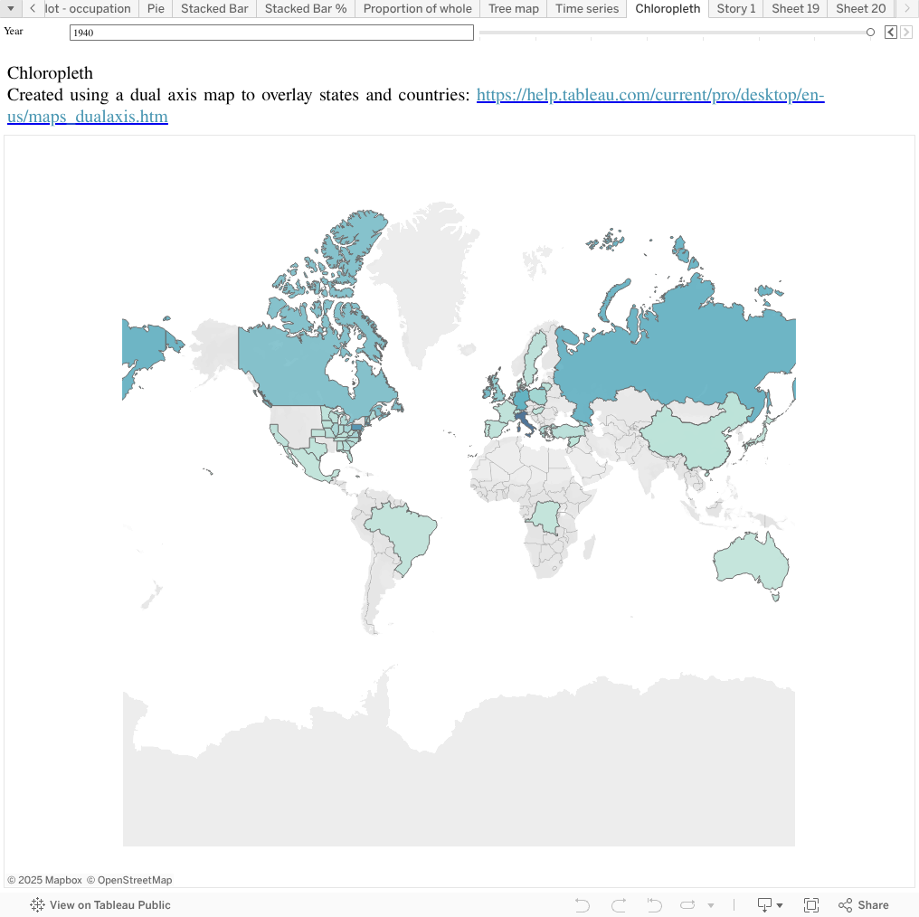
Chloropleth Map
- Drag Birthplace to Columns and in the “Show Me” menu select Maps (not symbol maps!) If Maps does not become selectable in “Show Me,” right click on Birthplace in the left sidebar and select Geographic Role > Country, then bo back to Show Me and select Maps
- Drag the new Longitude measure that has been created up to Columns
- In the Marks pane, there’s now accordion sections labeled All, Longitude, and Longitude
- Duplicate the Birthplace dimension. Tableau can only understand one “level” of geographic divisions (eg, if a dimension is interpreted as a state, it can’t be used to display country information even if it has state information in it). If we want to display the state and country information contained in a column, we have to duplicate it.
- To tell Tableau to read the copied column as state, right click and select Geographic Role > State
- Expand the first Longitude section under Marks. Remove Birthplace from the pane and drag Birthplace (copy) to Detail
- To layer these maps on top of each other, right click the right most Longitude pill in the Columns shelf. Select Dual Axis to layer the maps.
- Select All in the Marks pane and drag Albany-Census to Color
- Exclude NY
- Add a year filter with a single value slider
On your own
You have two options for finishing this assignment. For Option A: Tableau, you can create your own additional visualizations in Tableau, or in Option B: Observable you can walk through the optional Observable visualization lessons. Option B: Observable is a good option if you feel comfortable in javascript and Tableau and want an additional challenge. Option A: Tableau is a good option if you want to get more familiar with Tableau.
Option A: Tableau
On your own, create three additional visualizations. These can be modifications of one of the charts you made above (right click and duplicate to make a new sheet with the same chart) Only one of these can be a bar chart of any kind. All should be filtered in some way. At least one must use a visible filter like the Show Year slider we used above. All three must be a type of visualization we made above, not any of the other types of visualization available under Show Me.
In each of your three new visualizations, point out something of interest using an annotation.
Combine your three visualizations in a story or dashboard. Save your workbook, and from the uploaded version of the workbook available in your Tableau Public profile online, select the three dots icon in the lower right. Grab the embed code. On the course website, create a new post and embed your workbook in the post (if you don’t see an image of your workbook immediately after pasting, it means you didn’t grab the embed code). Before posting, make sure to check the Module 5 Assignment category.
Watch: Embedding
In the text below your embed, describe your three visualizations. You don’t need to analyze them or interpret them, but you should be able to narrate them. For example, if I were describing the visualization below, I would write:
In my chloropleth map, I mapped all birthplaces of Albany residents except New York. This map is colored by the number of people born in each location. I included a slider to filter by year.
As you create and narrate each visualization, refer back to our reading for this week for the language to describe what you’re doing, and how to think about relationships between what you’re comparing.
Option B: Observable
I’ve made a series of three lessons on D3 for you here. If you choose to do these optional assignments, you’ll walk through the process of writing a bar chart from scratch using census data.
Posting
Regardless of whether you chose Option A: Tableau or Option B: Observable to finish your assignment, make a new post here on the course site using the
After embedding and narrating your Tableau sheets (Option A) or discussing your lightbulb and roadblock moments on Observable (Option B), briefly discuss in your post the kind of work you’ve enjoyed in the course so far. Did you really enjoy the HTML/CSS assignment and designing your page? Was cleaning data strangely satisfying? Did fetching data with Python, making histograms in Tableau, or writing scales on Observable awaken something within you? We’ve had a lot of ups and downs learning new skills so far: think about the kind of work you want to do for your final project. We have two more “content” modules where you’ll learn about network analysis and spatial analysis, but these will expand on skills you already have.
If you find yourself strongly preferring one kind of work over another, consider doing a group project for the final project. I will not require anyone to do a group project, but in my experience with past courses, group projects can be more ambitious and are often pretty satisfying for group members because you get to focus on the kind of work you enjoy most. Project management and team work are also important skills that you need in many real-world jobs working with data. So if you love the web page design and chart creation parts of what we’ve done so far, but didn’t enjoy the fetching and cleaning data parts, consider teaming up with one (or more!) people who like the parts you’re not as comfortable with.
One reply on “5: Using Data”
[…] Tableau, open a workbook with geographic information (Like our Albany census workbook from Module 5). Make a new sheet and drag Longitude to Columns and Latitude to Rows. In the menu bar, select Map […]