Overview
For this class, I requested a license for all of you for ESRI ArcGIS Online, which is the browser version of ESRI’s desktop GIS package. The University has provided all of you with 1-year licenses; a personal 1-year license costs USD$100 in 2021. As a general rule, I prefer to teach with free tools because if you find yourself employed at a small institution or non-profits without a large technology budget, I want you to be able to do cool things without blowing your whole project budget (or personal budget, if you pursue these projects for your own research without institutional support). QGIS is my preferred program for GIS work because it’s free and more full-featured than the browser version of ArcGIS Online, but QGIS can be kind of a pain to install. If you find yourself in a job where you can’t afford an ArcGIS license, QGIS combined with some of the other free tools we’ll use in this lesson are a good alternative.
I’ve chosen to use ArcGIS Online for this class in part because being able to put ESRI ArcGIS on your resume can get your foot in the door for jobs. (We will talk a bit more about putting DH skills on your resume in Module 10).
GIS is a type of mapping software with many individual programs, like Microsoft Word and Mac Pages are specific wordprocessing programs or Adobe Photoshop and MS Paint are specific image editing programs. GIS, or Geographic Information Systems, is a way of digitally understanding geographic information, but it’s not the only way to make a map. Tableau is not a GIS program, but it can make perfectly serviceable maps, and sometimes it’s all you need for a project. You don’t always need a GIS program to make a map–like sometimes when you edit an image you just need straightforward MS Paint, and not the bells and whistles and expense of Photoshop.
Below, this lesson will walk you through some major concepts applied in the software we’re using, and then I’ll ask you to pick one to apply. If you’ve never used ArcGIS before and think you might like to, this is a good chance to try it out. If you’re not feeling spatial analysis, you can use Tableau instead and stretch those skills.
Navigating ArcGIS
To access ArcGIS, you’ll need to log in online at ua-esri.maps.arcgis.com using the access details you set up earlier in the semester. If you did not set up your access or can’t get in, please let me know. I can’t reset your login info myself, but I will ask the UAlbany license administrator to do so.
When you log in for the first time, there won’t be much there. Anything you save will be available for later access under Content (including StoryMaps, Maps, and web apps). To start a new project, go to the Map tab.
When you first start with a blank map, there’s not much there. We will mostly be using the Add Layer From Web and Add Layer From File options. It is possible to browse for layers that have been published by others, but most of these are very recent (1990 to present for the most part).
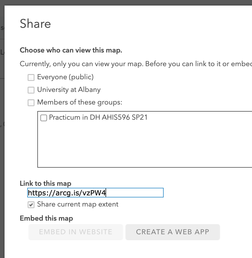
As you work on your map, you will need to manually save using the save icon on the top menu–do this often. If you want others to see your map, including for troubleshooting and publishing for your final project, you will need to enable sharing. For troubleshooting, you can share to just UAlbany viewers (that will include me and the rest of the class), or to just people in our class by requesting to join the class group here and coming back to change your share settings. You do not need to join the class group if you don’t want to limit access to your project. If you choose to publish part of your project using ArcGIS, you will need to change your share settings to Everyone before you post your final project. Your student details are not connected to your ArcGIS profile; you can see and change what information about you is publicly available at your profile settings.
A final word about ArcGIS: our ArcGIS Online license through UAlbany is incredibly limited for cost reasons. There are many things that ArcGIS Online can technically do, like count how many items are within an area; find network connections between points through a network of roads; find distances between all points; and find clusters of similar points. We don’t have access to these analytical functions because they cost extra and our license doesn’t include them, which makes ArcGIS functionally a display platform rather than an analysis platform for us.
You do have access to the full-featured version of ArcGIS Desktop as downloadable software for one year. If you think that you may want to do more mapping analysis for your final project, it may be worth downloading and the software download is available in your settings tab (there are several options here; ArcGIS Pro is the one you want). However, ArcGIS Desktop is only available for PCs and not Mac, which is why I have chosen to not require it for this lesson. If you choose to pursue part of your project using ArcGIS Desktop, I will help when you get stuck and make suggestions, but keep in mind for your own google troubleshooting that there are many (many, many) different versions of ArcGIS with only slightly different names, and it is possible to go down a rabbit hole trying to figure out how to do something that your license doesn’t actually allow. If you google, make sure to look up ArcGIS Desktop Pro. Start with the Help documentation if you decide to go this route.
Understanding Layers
Many map programs use a “basemap” with one or more component layers. Usually these are set to a modern default with interstates and state or national boundaries marked and labeled. Sometimes for historical applications we don’t need these or they’re distracting–if we were mapping 19th century cholera outbreaks, including the modern interstate might not make sense for the story we’re trying to tell. These components can often be turned off or individually styled.
In Tableau: You can choose color schemes and individual components like national, state, and country boundaries, roads, and types of labels to include. These options are available for styling in the Map > Map Layers section of the menu bar, which will bring up a left-hand sidebar with several options.
In AcrGIS: Change your basemap by clicking the Basemap tab and selecting a map that looks nice to you (doesn’t matter which one for this assignment). ArcGIS only has a few defaults built in, but we’ll learn how to add others later.
1: Georectification
Georectification is the process of matching points on a historical map to a current projection like Google Maps, and laying the historical map over the current projection. Think of it like stretching a rubber sheet and the image printed on it–depending on how closely the historical map creation corresponds to current mapping practices, the historical map may be quite distorted!
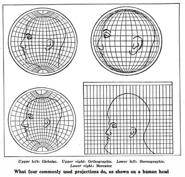
The common Google-Maps style view from above we’re most familiar with is among the most distorted ways to create a map: the mercator style projection of a human head you see in the lower right image above is the most commonly used one. If your historical map used a different projection system, then it may look very distorted indeed!
Georectification can be done in desktop GIS programs like QGIS and (desktop) ArcGIS, or in web platforms like MapWarper and the New York Public Library MapWarper (different websites, running the same software). See the video below or this tutorial for a quick overview of how this is done on the NYPL MapWarper. I’m not requiring you read/watch these, but I’m providing them here in case you want to rectify a map as part of your final project. In general, if you’re rectifying a map of your own you want to work with as large a file as possible, because this will keep more detail when zoomed in. If you’re just displaying a map and you don’t need it to be super precise, a few pins around the edges of the map is fine. If you need more precision for later analysis–for example you’re mapping 18th century towns and later you’ll count how many were on each side of a river–you’ll need to be more precise about pinning the river down the middle of the map to its modern counterpart, to be sure that the towns are rectified more precisely.
In former versions of this class, I’ve assigned a map rectification for this unit because the process of matching can be informative (it’s fiddly!). I’m no longer doing this because almost all of the historical maps of Albany that I’m aware of have already been rectified. If you’re working on an Albany or New York area project, you’re the beneficiary of this work! There are many maps already available for you to use. If you’re working on a different area, the David Rumsey collection, the Library of Congress, the British Library, and many other institutions with digital collections have maps available for download that are already rectified or can be rectified.
For some webmapping services, you’ll need to download a geotiff of the rectified map. This is a special image file that has encoded within it geographic coordinates. For others, you’ll need a wms or tiles url. These are special urls that serve up the map to other websites. I’ll specify which you need when we get there.
Displaying a Georectified Map
If you only want to display a georectified map–perhaps so that it will show up under other data like the map of Albany below–you only need to drop a url into your preferred platform. We’ll do ArcGIS first, then two ways in Tableau.
1A: ArcGIS
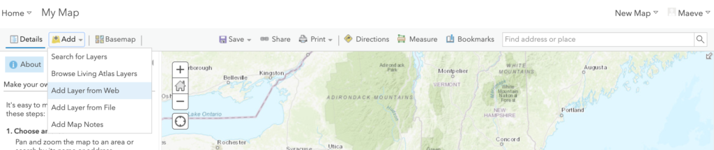
While you’re logged in to your ArcGIS account, click the Map tab to create a new map. From there, zoom in to the Albany area, and then click the Add button and select Add Layer from Web. This will bring up the menu below. Select A WMS OGC Web Service in the dropdown menu.
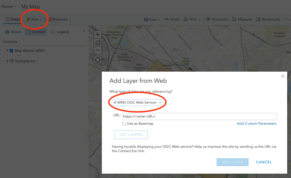
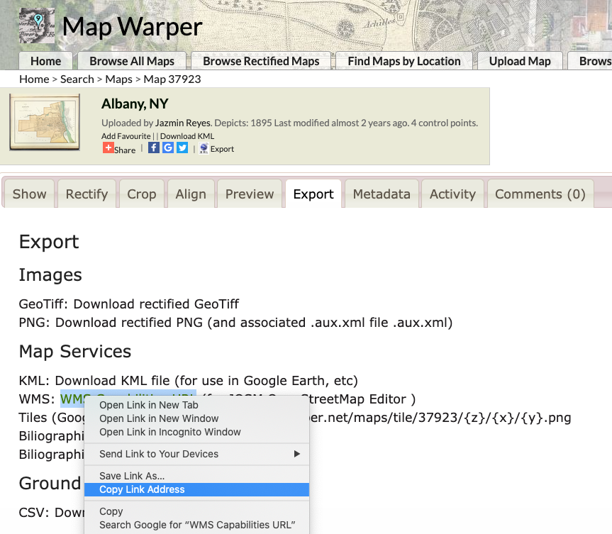
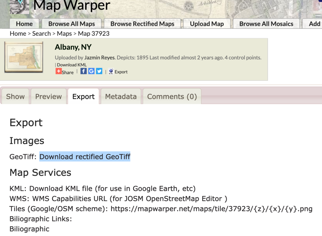
In another tab, open this MapWarper map of Albany. In the preview tab, check out how it will look when we import it, and then go to the Export tab.
There are many ways to export a rectified map, but a WMS or Web Map Service url is usually the easiest way. This sends the rectified map directly from MapWarper to ArcGIS or other internet-connected services. Right click WMS Capabilities URL and Copy Link Address.
Back in ArcGIS, paste (CMD-V/Ctrl-V, or right click > paste) into the url field, then click elsewhere to get the menu to register that there’s a url in the box. Once the blue Add Layer button is active, click it and tada! You have a rectified historical map overlaid on Albany.
1B: Tableau Method 1
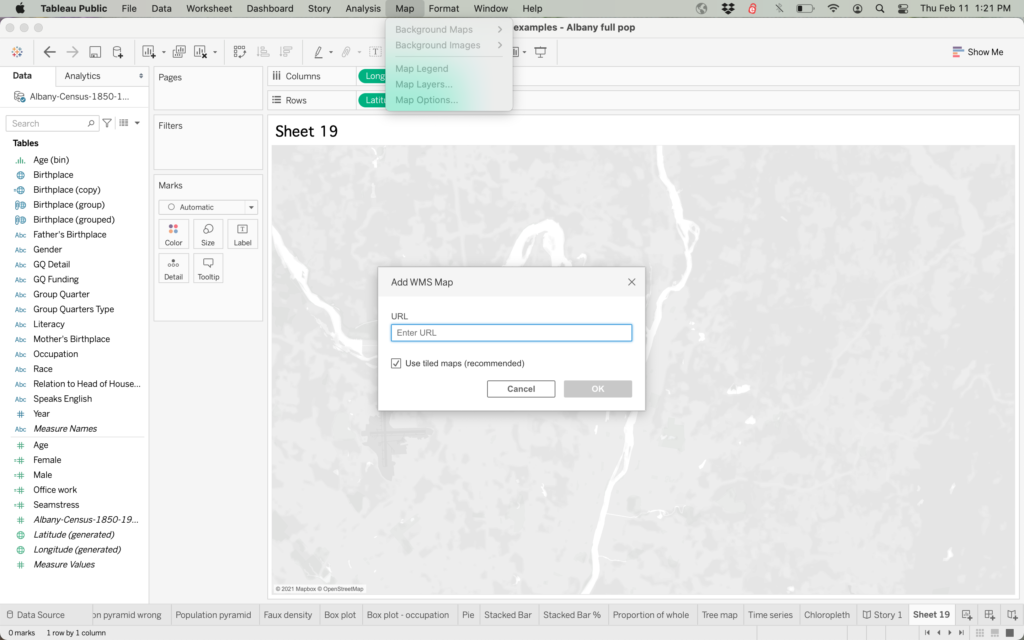
In Tableau, open a workbook with geographic information (Like our Albany census workbook from Module 5). Make a new sheet and drag Longitude to Columns and Latitude to Rows. In the menu bar, select Map > Background Maps > Add WMS Map. This will give you the menu you see below. In the url field, add the same WMS url we used for ArcGIS above.
After importing your rectified map, Tableau may give you a warning like this:
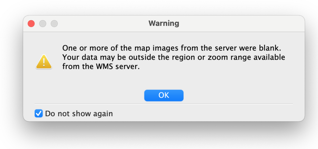
This is because Tableau will only “see” the map we imported and literally nothing else. Dismiss this message with “Do not show again.” If you click OK and look at your Tableau sheet now, you’ll see your rectified map–and empty white space all around it. This can be ok for a project where you only need to display data that will fall on our historic map, like if we were mapping a list of historic businesses in the city of Albany. The white space will still function as a map, but it won’t have any map image displayed. If you had a project where you want to show a rectified historic map within modern context, you’ll need to do Method 2 below.
1C: Tableau Method 2
The second method uses a third party service MapBox, which has both paid and free service tiers. To use this service, you need to make a free account. You don’t need to make an account for this assignment, but I will walk through the steps of using it as though you have an account.
Once you have a MapBox account, you’ll access the studio space from the front page or from studio.mapbox.com. From there, we’ll make a new style. This will allow us to make our rectified map a layer within a larger map, and style the way our overall map looks.
Mapbox has six default styles that can be customized with different color sets. If you’re walking through this as part of the assignment, choose any style and color set that appeals to you and hit Customize.
Once you see your map, use the search bar at the top to search for Albany NY. This will let us see if our map is imported right away.
Then select the layers tab on the top left and the plus icon for Add New Layer. This will change your map in what looks like a scary way, but it’s ok! This is just a view of the underlying data of our map, and it will change back when we’re done.
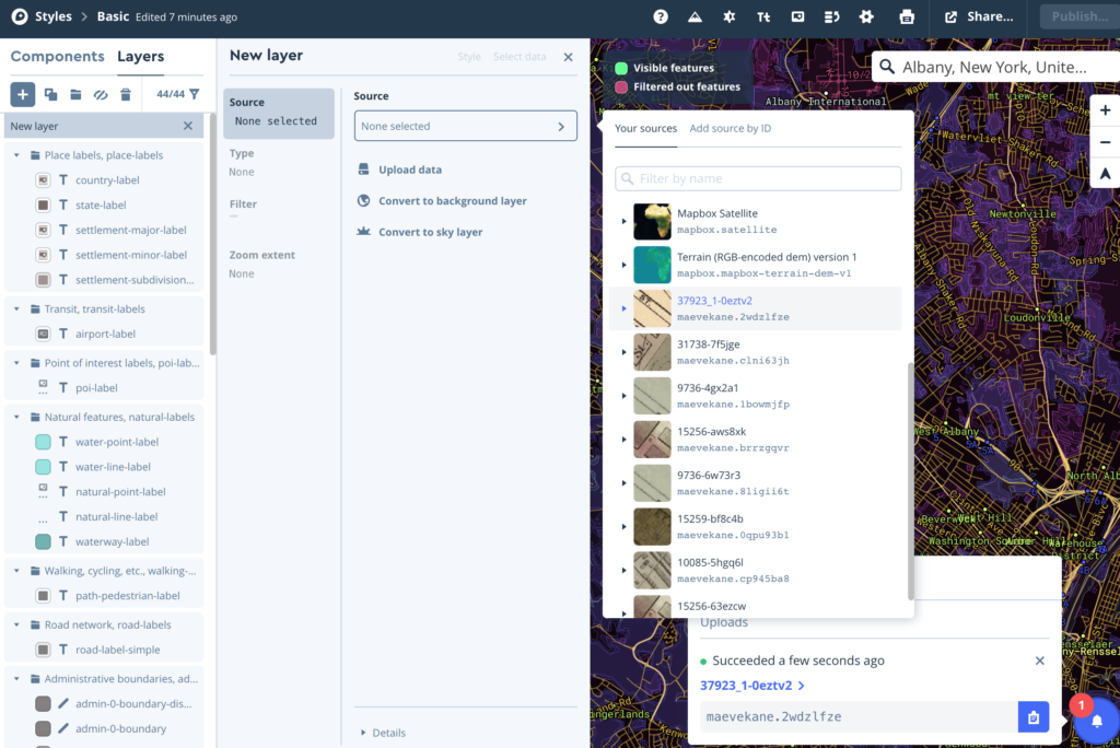
Back on our MapWarper export tab, this time we’re going to download the geotiff of our map by clicking “Download rectified GeoTiff.” Keep track of where this is saved on your computer, because we’ll be uploading it in MapBox next.
In the MapBox add layer interface, we’ll click upload data and drag and drop or select the geotiff we downloaded. After confirming, we wait. Geotiffs are fairly large files, so it may take a few minutes. (For me, it took about four minutes to upload the linked file).
After your file has finished processing, the little bell icon in the lower right will show “Succeeded.” Still in the Add Layer interface, you can click Source and find your new map layer in the menu that comes up. Your newly uploaded map will be at the very bottom after scrolling down; mine is in the middle because of my other projects. Click the small image icon for your uploaded map, which will expand a small menu. Click the three small squares icon in the expanded menu.
Now if we click back to the Components tab, we’ll see our rectified map nicely layered over the modern map!

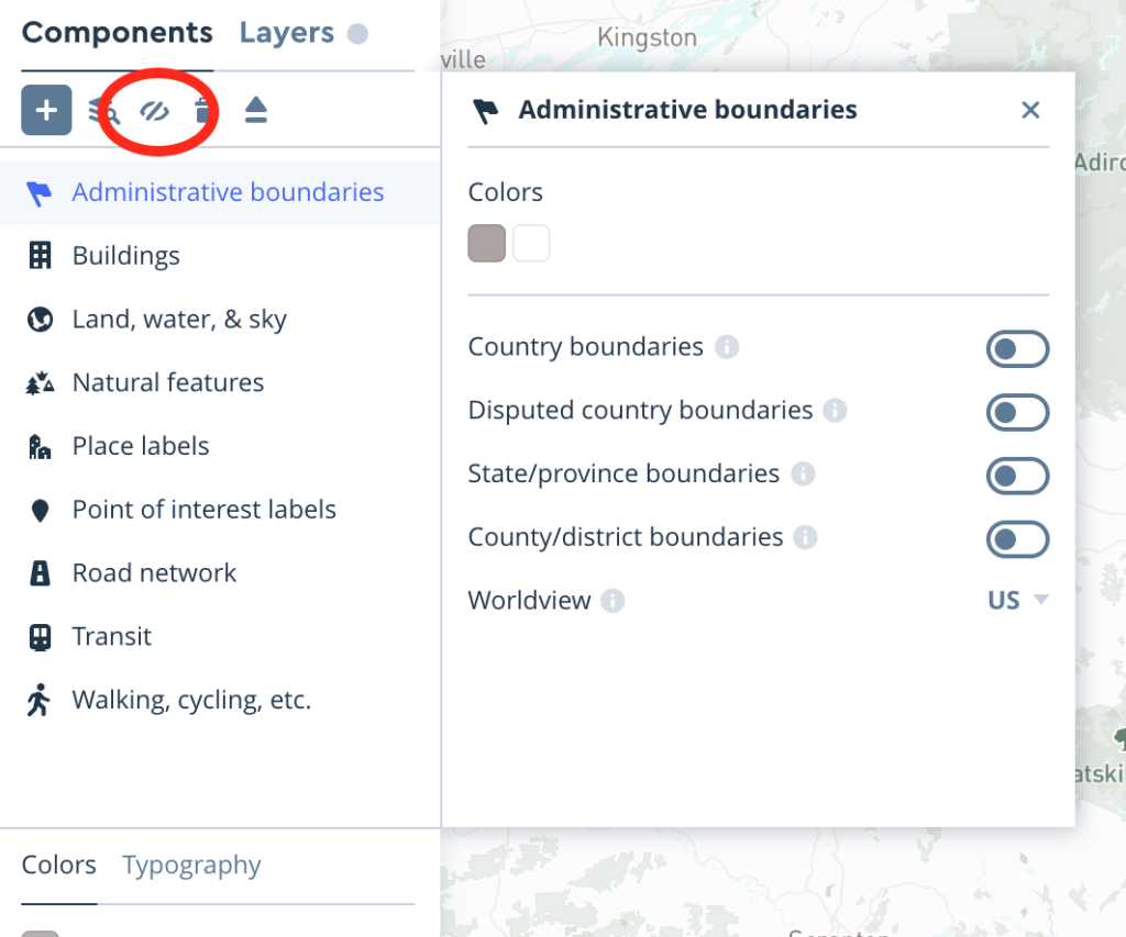
MapBox can do some extremely detailed styling. If we, for example, were mapping medieval monasteries, we might not want modern roads, towns, parks, and national borders on our map. These can be turned off as groups in MapBox by clicking the group category in Components and then clicking the slashed eye icon above the category list. Not everything can be completely turned off within MapBox, but we can further work with things once we get it into Tableau.
The color of different components can be customized as well. For a large scale, public facing project, it’s good practice to have an external document that lists the hex codes for all the colors used across the project so that your purple roads in one place are the same purple as your bar charts, for example. It’s also good practice to select high contrast color palettes that work for different vision deficiencies, including low vision and different types of color blindness. In general, high contrast is more accessible for a wide range of accessibility needs than low contrast. Color Brewer is a nice utility that lets you preview how different color palettes will work and has an option to only use color blind friendly palettes.
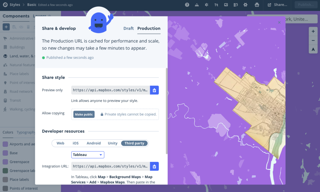
Once we’re happy with our hot purple historic map, click Publish in the upper right to make our map available to other services. If you come back and make any further changes to your map, you’ll need to publish again.
Once your map is published, select the Share button in the upper right. This will give you many options; we want to select Third Party down near the bottom, and Tableau in the drop down menu. (You may notice that ArcGIS is an option here as well–you could use this to style your ArcGIS map too! The instructions are below the integration url).
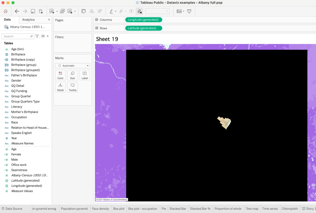
In our Tableau workbook, we’ll select Map > Background Maps > Add MapBox Map and drop our url in the menu that appears.
Your newly imported MapBox style may look like hot garbage and that’s ok! Sometimes Tableau doesn’t play well updating areas around rectified maps, so you’ll get a big black box like mine below. This is ok!
After you save your Tableau map and embed it somewhere, the map around your rectified map will look normal like mine below. In Tableau, you can also turn on and off layers by selecting Map > Map Layers and selecting and deselecting parts of your map in the left hand menu that appears.

<script type='text/javascript'> var divElement = document.getElementById('viz1613072914462'); var vizElement = divElement.getElementsByTagName('object')[0]; vizElement.style.width='100%';vizElement.style.height=(divElement.offsetWidth*0.75)+'px'; var scriptElement = document.createElement('script'); scriptElement.src = 'https://public.tableau.com/javascripts/api/viz_v1.js'; vizElement.parentNode.insertBefore(scriptElement, vizElement); </script>If you need to access or edit your MapBox style later, you can always go back to it at studio.mapbox.com.
2: Getting Data from Maps
Now we can look at our historical map, but we can’t, say, count how many businesses from our list are in each ward shown on the map. (We could do this with our human eyeballs, but this class is all about learning to make a program do something for us). To extract features from a historic map, we’re going to make a shapefile.
A shapefile (with .shp file extension) is a kind of geographic file that can be read by ArcGIS (online and desktop), QGIS, Tableau, and some other programs intended for geographic display and analysis. It displays information in three ways: as points; lines; and polygons.
A point is exactly what it sounds like. It’s a specific latitude and longitude coordinate that will display as a single dot or marker in your mapping program. Usually these are used to display individual addresses, towns, or specific places.
A line is a series of points. It’s composed of straight lines drawn between many points, like connect-the-dots. Usually these are used to display roads, rivers, the path of an army, or reconstructed historical paths. Although a line is composed of straight lines, visually it can appear curved if it’s made up of many small segments.
A polygon is a set of points with mathematical information about how they’re connected to make a multi-sided shape (like a square–this sounds more complicated than it is, but it can be helpful to understand the principle).
A point, line, or polygon can have several properties: these might be things like an ID number, a street address, a year, the name of a person associated with that place, or the type of building. These properties are like the columns of a spreadsheet and should follow the same principle: one column, one purpose.
Tableau can’t make shapefiles, but it can import them from other prorams. ArcGIS Online can make shapefiles, but it won’t export them for use in other programs. Together, this is very annoying. ArcGIS Pro Desktop and QGIS can make shapefiles, import them, and export them. If you find yourself doing a lot of this kind of work, a desktop program like ArcGIS Pro Desktop or QGIS are better long term options, but the principles are the same as the workarounds we’ll use here.
If you only want to display your shapes (points, lines, or polygons) in ArcGIS Online, you can make them directly there as a “Map Notes” layer. In ArcGIS Online these are functionally display-only. They can have a brief description and name attached, with the option to embed a photo for display, but our license does not include analysis options.
If you’re not sure if you’re going to use ArcGIS or Tableau, or you think you want to do some analysis in Tableau with your shapes (for example, count the number of business within a historic city ward or number of events within the borders of a nation that no longer exists), creating your shapes in a third party application like Maptiler is a better option. Maptiler requires a free account to use, which you can make with your google account or a separate email.
Watch: Creating Shapefiles for ArcGIS, Tableau, or D3
If you want to try this yourself with the maps used in the video above, find the 1686 James Eights map of Albany on MapWarper here and the 1839 map of Columbia County on David Rumsey here. To get the GIS application links from David Rumsey, you will need to make a free account using your Google account or an email address.
3: Adding Data to Maps with Geocoding
ArcGIS and Tableau can both be used to geocode a list of places like we did in our Colabs Geocoding assignment. You may be asking here why I made you do the geocoding assignment by hand in Python. I made you suffer through that because I want you to understand the principle behind how geocoding works, so that you don’t rely on putting things in a magic black box without understanding what it does. Being able to geocode yourself also gives you more flexibility, so that you’re not tied to the one program where you know how to click buttons that you may lose access to. (And because the license we have for ArcGIS through the University doesn’t allow us to download and use elsewhere anything we’ve geocoded in it!)
In ArcGIS, we can geocode a list of places by uploading a csv file. Download this list of placenames from the API assignment and select Add > Add Layer From File. Select the placelist.txt file you downloaded in the file upload field, and you should see a box like this:
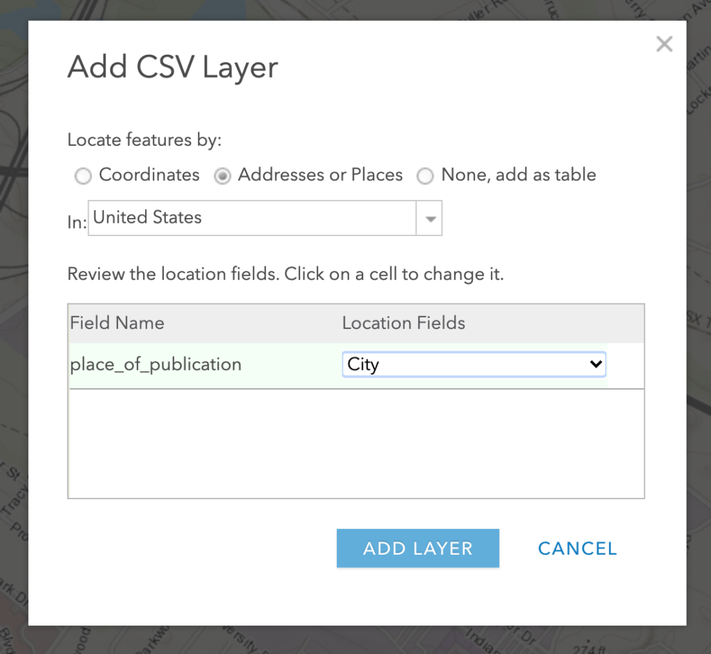
Most mapping programs will need to be told what kind of fields they’re dealing with, and where to look to get best results. Here, we specify that we have a list of places in the United States, and that our place_of_publication column is City information. If you had a csv sheet with separate city, state, country, or address columns, you could specify these separately.
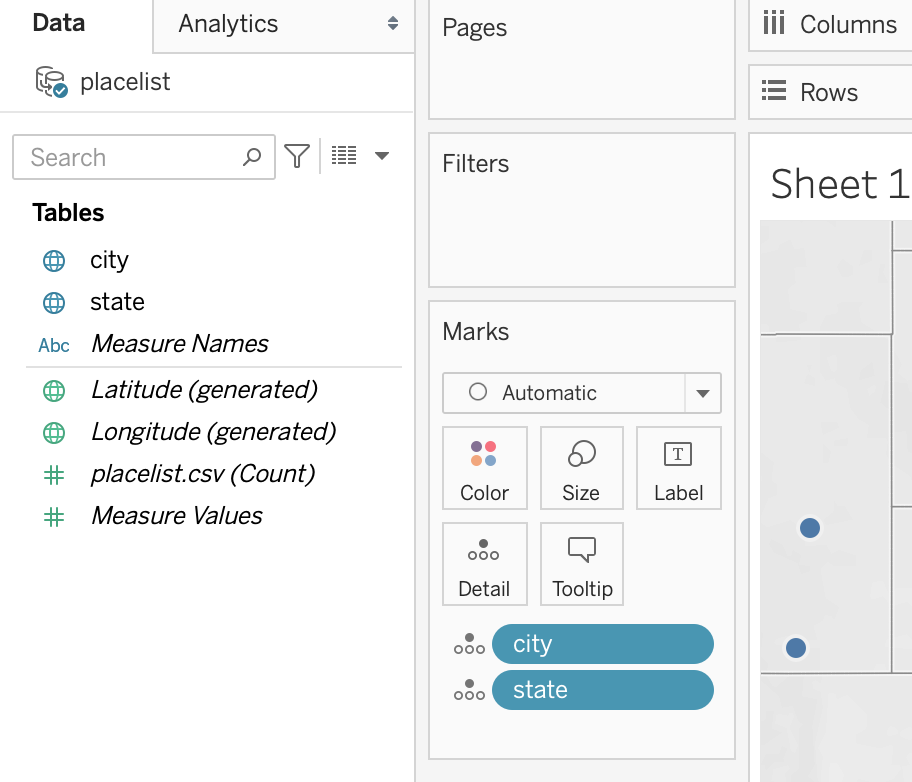
In Tableau, designating a column with a geographic role like City or State (or just importing columns with these names) is enough to allow Tableau to geocode that information. You’ve already done this with the chloropleth map in the Tableau assignment; Tableau can also geocode specific addresses and city names, though sometimes not with great precision. If there is information in your column that Tableau can’t geocode, there will be a small grey box in the lower right of your map that says “39 nulls” or whatever the number is. Clicking this will allow you to manually set the location of these places Tableau couldn’t find, but you have to do it by hand and you can’t re-export your geocoded information to use elsewhere.
Tableau’s built in geocoding is much stupider than the Google Maps API or ArcGIS. To geocode in Tableau, you’ll need to separate our placelist into separate columns of city and state like this csv (same places, formatted differently using OpenRefine’s text to columns function to split the text at commas, with the county information deleted and the state abbreviations cleaned up). Tableau prefers columns to be named with geographic roles like city, state, and country, or designated with these roles by right click > Geographic Role > whatever geographic level you’re matching a field to. A field with a little globe icon can be dragged to the details pane of the Marks card, and more geographic levels added like city + state will give better results than city alone.
Publishing
Tableau
If you choose to do your mapping in Tableau, to publish you can simply save your workbook and embed your map on your chosen platform the way we did for the Tableau assignment.
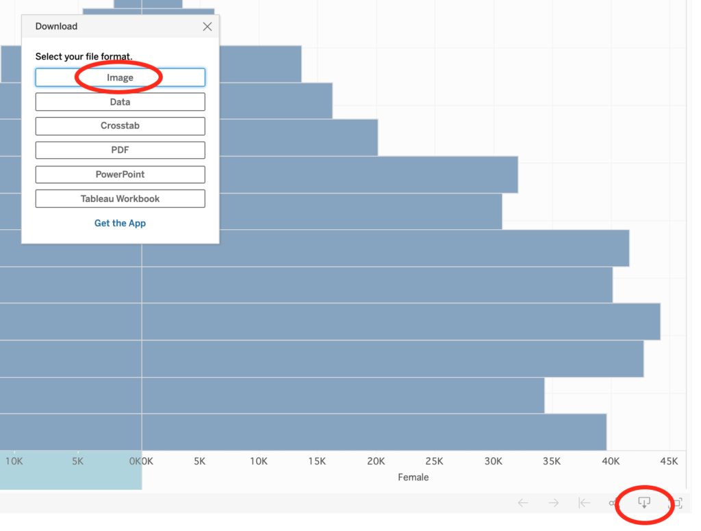
If you’re working with a print publication, you can also export images of your Tableau worksheets from your profile on public.tableau.com after saving by clicking the download icon in the lower right and selecting image to save and post elsewhere.
ArcGIS StoryMaps
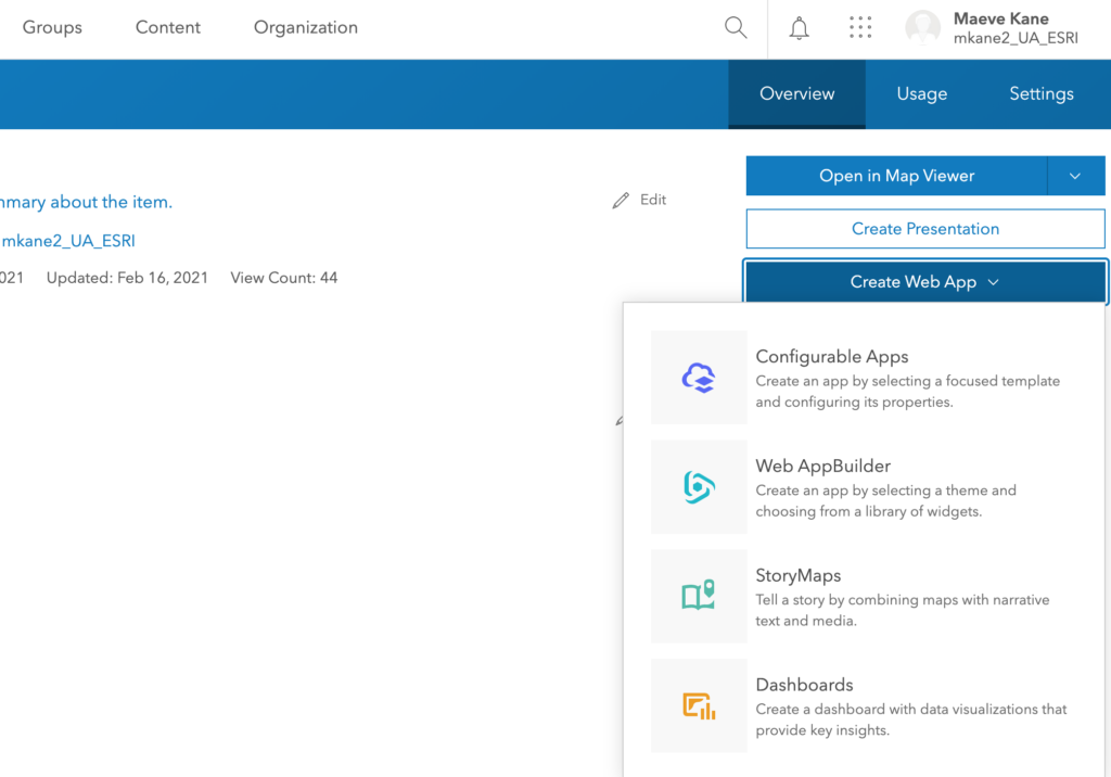
Once you have one or more ArcGIS maps (or even if you have none), you can use ArcGIS’s StoryMaps builder to create a multimedia essay. You can start by logging in at storymaps.arcgis.com using your ua-esri account, or start from one of the maps you’ve created. From your Content tab, select the map you want to include in your StoryMap, then select Create Web App > StoryMaps.
You can see a demo StoryMap and read more about some possibilities and limitations to think about for our class here.
Some examples of real projects using StoryMaps:
- Mount Vernon, Forgotten No Longer
- James Cook: The Third Voyage
- New Brunswick Loyalist Journeys
- Visualizing Indigenous Persistence during Spanish Colonization of the San Francisco Bay Area
- The Trans Atlantic Slave Trade
- Slave Trader Routes
ArcGIS WebApp
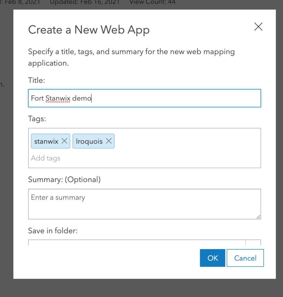
A webapp is basically a nice user interface for others to look at the same map you’ve been working with in the Map tab. You can create a webapp by going to the Content tab and selecting the name of the map you’d like to make available. Like a storymap, clicking “Create a webapp” in the right hand menu will give you the option create many different things, but this time you’ll select Web App. After entering some details, you’ll be taken to the customization screen for your web app.
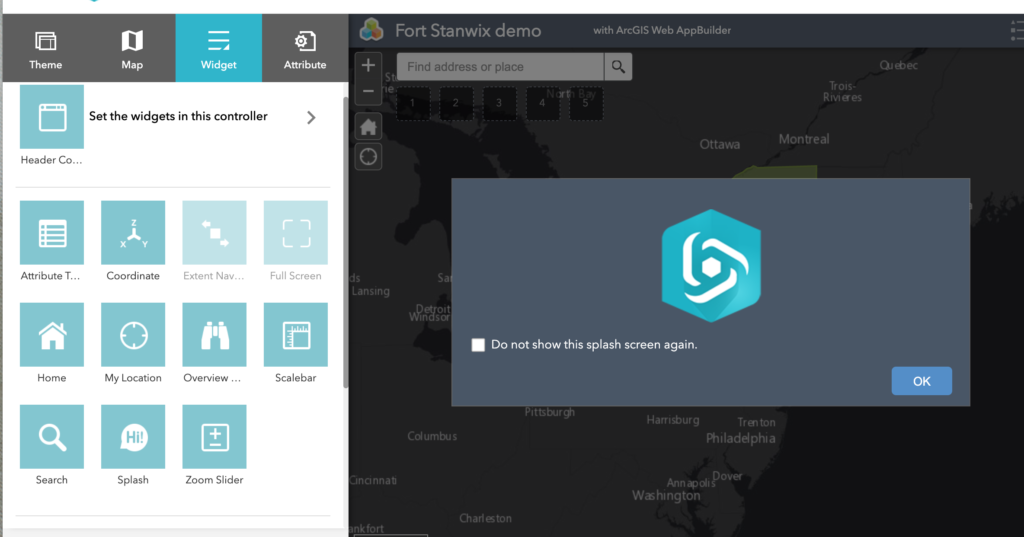
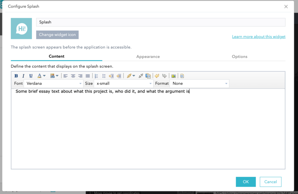
Due to the limitations of our license, there is not a lot you can customize in the web app. For some basic customization, it’s nice to customize the Splash widget at a minimum (this allows you to write a brief description of your project, like the abstract of an article).
There are some cool features in web apps that can add a significant analytical dimension to a historical project that you will need to use ArcGIS Desktop for. One of the most significant one is the timeline function, which shows changes in your data over time like this companion project to Elizabeth Fenn’s Pox Americana. To enable this timeline function in your web app, you’ll need to encode temporal data in ArcGIS and then share to the web.
Conclusion
If you choose to do this optional assignment, choose one method outlined above (1A: Georectification for ArcGIS; 1B: Georectification Tableau Method 1; 1C: Georectification Tableau Method 2; 2: Getting Data from Maps; or 3: Adding Data to Maps with Geocoding) and the appropriate publishing method for your chosen platform. This is a good opportunity to try out a mapping method on the data you’ve selected for your final project, or you can use the sample maps and data I’ve used in the examples above. When you’re done, post your work on the course site using the Module 8 Assignment: Maps category with a short description of what you did. (If you publish using ArcGIS StoryMaps or a Web App, just link your work, since those platforms don’t embed on other platforms).
One reply on “Lesson: Maps”
[…] Do the Maps lesson. This looks very long because I outline for you how to do several different methods in two […]