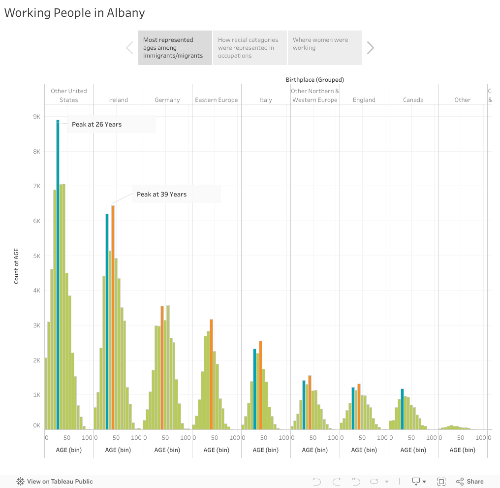
In my histogram, I visualized the distribution of ages for each birthplace group. I then highlighted two ages that stuck out to me, 26 and 39. Almost all my birthplace groups have one of these ages as their highest or their second highest age bin. Since these birthplace groups signify all Albany residents who were not born in New York, these peaks open up the possibility that 26 and 39 might be the most common ages for people to either immigrate or migrate to Albany from another country or state.
<script type='text/javascript'> var divElement = document.getElementById('viz1615476308737'); var vizElement = divElement.getElementsByTagName('object')[0]; vizElement.style.width='1016px';vizElement.style.height='991px'; var scriptElement = document.createElement('script'); scriptElement.src = 'https://public.tableau.com/javascripts/api/viz_v1.js'; vizElement.parentNode.insertBefore(scriptElement, vizElement); </script>
<script type='text/javascript'> var divElement = document.getElementById('viz1615478253532'); var vizElement = divElement.getElementsByTagName('object')[0]; vizElement.style.width='1016px';vizElement.style.height='991px'; var scriptElement = document.createElement('script'); scriptElement.src = 'https://public.tableau.com/javascripts/api/viz_v1.js'; vizElement.parentNode.insertBefore(scriptElement, vizElement); </script>In my bar chart, I visualized the number of Albany residents for each occupation, colored by racial category. This was my trickiest visualization because I had to decide how I wanted to filter the occupation categories. My categories are not perfect by any means, but I wanted to do my best to highlight those categories where minority racial identities are most represented. Because Albany had such a large white population during this time, it is easy for people of color to go unnoticed and disappear into tiny slivers on each bar. I wanted to highlight that Porter was the only occupation where a nonwhite category was the majority, so I kept it ungrouped.

<script type='text/javascript'> var divElement = document.getElementById('viz1615578676303'); var vizElement = divElement.getElementsByTagName('object')[0]; vizElement.style.width='1016px';vizElement.style.height='991px'; var scriptElement = document.createElement('script'); scriptElement.src = 'https://public.tableau.com/javascripts/api/viz_v1.js'; vizElement.parentNode.insertBefore(scriptElement, vizElement); </script>In my tree map, I visualized Occupation sized by the number of women in each category. I included a slider to filter by year. My annotation highlights the rise of Office Work as a growing occupation for women throughout the twentieth century.
Here is the link. How do we upload the entire Story using one embedded code so it is possible to tab through the three visualizations together?
Tableau was really tough for me! I really enjoyed it though, especially grouping the variables because it felt a lot like cleaning data in OpenRefine. I plan on using both Tableau and OpenRefine for my final project so I can clean the data I’ll be working with and then visualize the variables in different ways to better analyze them. I struggled more with designing my page than I did while working on the HTML/CSS assignments, but I feel much more comfortable with both Python and JavaScript now. I’ve been out of my element, but Tableau has definitely brought me back to my background as a qualitative researcher in the social sciences. I feel much more grounded while making charts and maps than I did while coding and writing functions.
One reply on “5: Using Data”
Update: I figured out why my last chart wasn’t showing up. I was trying to embed my code using a “code block” rather than a “paragraph block”. I didn’t realize the visual would only appear if the code was embedded in a specific block type!