Intro: Little bit about the Bigfoot phenomenon, into to the project
Little blurb about how this allows us to narrow the search. Little blurb about what other variables could be used to find bigfoot. These
Drafts of seasonal variables
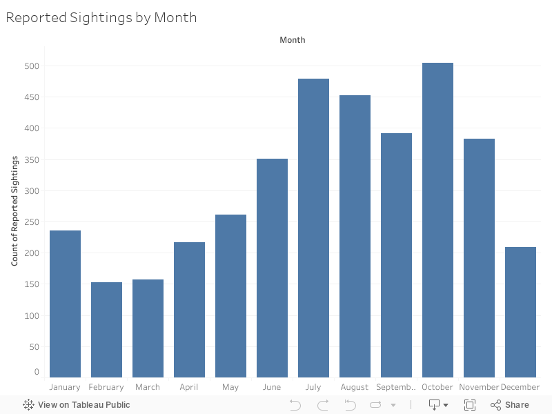
This bar graph shows the raw peak months for reported sightings. Below I add states, while the viewer can filter to include any state(s) they choose, I start with the 5 states with hotzones indicated by the heat map.
Below behold a line graph of the top 5 states views per month.


I’m ultimately going to do more and different charts/graphs with this seasonal/month info but for now this is what I have. I’m going to explore more to see if I want to combine these at all.
New Section: Weather
I’ve also decided that I want to focus on weather and moon phase more than elevation, so unless the Elevation API stuff takes a while to set up, I think I’m going to not go that route unless nothing compelling comes from the rest of my data. I also don’t think I’m going to be doing anything with the population data because other people have already done that.
New Section: Moon Phases
This section will feature graphs/charts with moon phase data.
New Section: Putting it Together
This section I’ll combine some of the variables for visuals that (hopefully) demonstrate when/where and under what conditions to start your Bigfoot Hunt.
Notes:
I am interested in seasonal data for 2 reasons, National Park visitors and bears.
Bears hibernate and a lot of people believe that Bigfoot can be written off as misidentified bear sightings.
Do the months with more sightings correlate with the months with the most national park visitors?
I think I’m going to include a methodology section with general explainers as well. I think this will be at the end of the blog post.
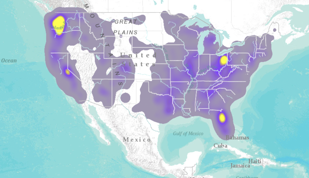
For the maps I’m experimenting with clustering, heat maps and regular maps, and different basemaps as well.
The regular map with each sighting shown probably conveys the number of sightings the best, but I really like the look of heat maps and I think they are easily convey the areas with lots of sightings the best.
One reply on “Week 10: Update to the Update”
Your heatmap kind of calls the National Parks thesis into question–I don’t think there’s a natl park in Ohio, and the only one in Florida I think is Everglades. The heatmap is very striking! If you want to do that in Tableau so it can interact with your other visualizations, Tableau does heatmaps as well. I can’t remember if your data has counties, but if it does not, you can give google maps api the lat/lon combo and use it to look up the county–that would help you narrow down if the sightings are in/near national parks or other big tourist destinations.
The monthly numbers there are pretty interesting–CA, OR and OH peak slightly earlier than FL and WA. I wonder if there’s some other animal like mountain lions or something that are more active later in the year in those states vs bears in other states.
What’s the year spread of your bigfoot data (ie, like 1970 to present?) I wonder if there’s a story there in increased numbers of national park visitors over time.