For my final project, I plan on using an essay structure and then embedding visualizations into it to support the conclusions/analysis of the data. For the overall argument, I plan on doing an analysis of employment for women during 1930 and 1931. This will focus on the North East and Northern Mid West because the data is limited to those states. I am researching the historical context of women at work – the data shows that more women held jobs in rural communities than urban areas so I am looking for historiography that either supports or contradicts that. The data includes a LOT of variables so I am trying to narrow down the scope of my argument a little bit so it is easier to follow.
Visualization 1 Draft
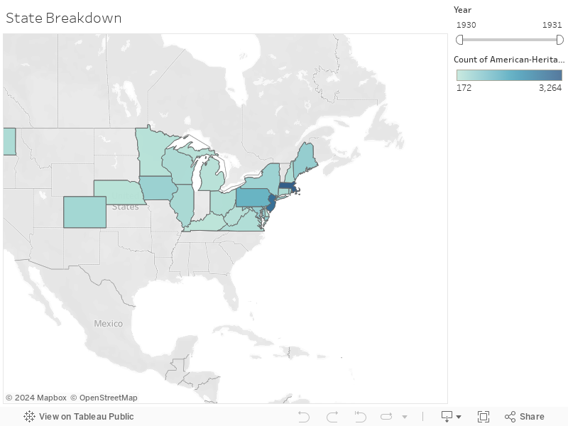
In my first visualization, my goal is to show where the data was collected from. I added a year filter because different states were included in 1930 and 1931.
Visualization 2 Draft
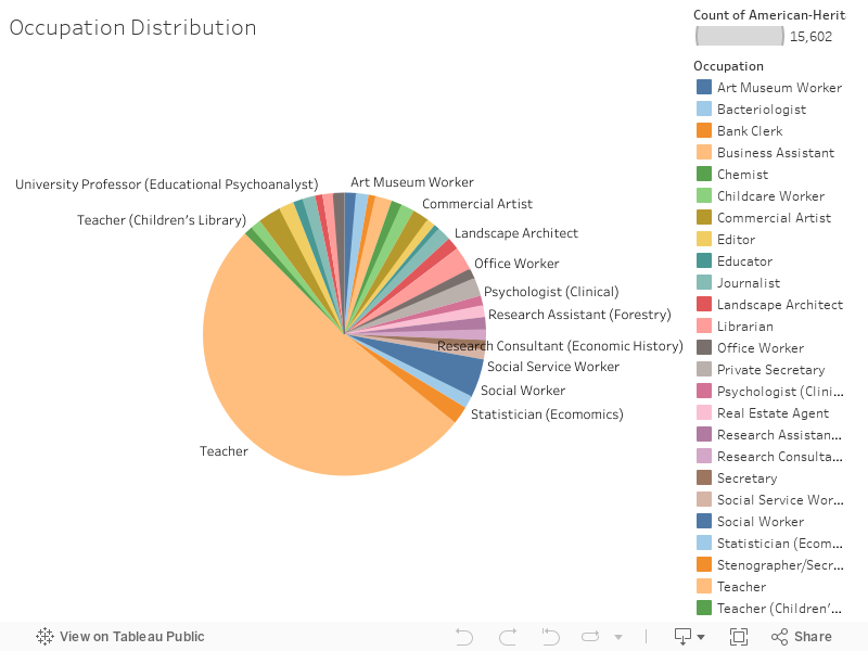
In my second visualization, I wanted to show the various occupations that women held in this period.
Visualization 3 Draft (Story)

In my third visualization, I included a story to show the ages of the women involved in the data collection and the average amount of hours worked by women of each age. The goal of this visualization is to analyze the age where the amount of work women completed peaked and when it began to decrease (if at all). It is important to note that this is the hours worked for employment, not the time spent on household tasks. Here is the link to the story in case the embedded version does not work.
Visualization 4 Draft
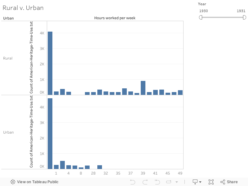
The fourth visualization compares the hours worked by women who lived in urban settings compared to women who lived in rural settings. As the graphs show, women who worked in rural settings worked more hours a week than women who lived in urban areas. Again, this is the hours worked for employment and not household tasks.
Extra Visualization on Just Hours Worked Per Week
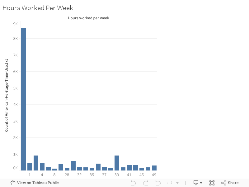
This shows how many hours women worked per week for their job overall.
After completing the visualizations I drafted, I realized that the group of women who were unemployed are not represented in the visualizations. I am going to add a pie chart showing the percentages of women employed v. unemployed and more visualizations on the types of housework and time spent on the tasks.
One reply on “Module 10: Work”
For the visualizations, I don’t think you really need the year slider. With only two years, you’re not really going to be able to be able to show change over time, so adding the year slider just adds an interaction that doesn’t show a meaningful change when interacted with. Consider making a dashboard with your chloropleth + some other visualization, where you click on a state and see eg a bar graph breaking down the different occupations or similar. That would help show your argument about rural vs urban occupations and tease out whether there are any regional differences.
For #2, remember that pie charts can be pretty confusing to read, and this one especially is. You can use Tableau’s group function to collapse eg “social service worker” and “social worker” into one group, and all the types of teacher into another group, etc, to simplify and better represent your data whether you use a pie chart or go with something else. I would also investigate your data to see if more than one person has some of the jobs that are just tiny slices–I would have to look back at your data to check, but it looks to me like the 200 for psychologist, 200 for real estate agent, etc, are actually one person who is a psychologist made 200 diary entries, because I don’t think you have that many individual people in your data. I’m going to fiddle with your workbook later this afternoon and see if there’s an easy way to do that, but I wanted you to have a heads up on that.
I like the age vs. hours worked story, that’s a nice way of presenting that. I think the treemap is a little messy–I would look at grouping your ages by decade so that you can show an average for women in their 20s vs 30s vs 40s, etc. I believe you should be able to use the formula here, just sub out your age column for year.
I’m surprised by the urban vs rural employment divide. I don’t do the 20th century myself, but I think that’s very worth pursuing in the literature since this is right at the beginning of the depression, which I wonder if that factors in. If your data allows it, I would look at making separate graphs of
rural employed women’s housework | rural unemployed women’s housework
______________________
urban employed women’s housework | urban unemployed women’s housework
So that you can compare at a glance the four different groups in a dashboard. I think this is what you’re suggesting at the end, but I wasn’t clear on it.