Pivoting to the War Department Papers! Truly this sketch should be in the MOMA. Maybe even the Louvre.

Intro: The project will begin with an introduction to the topic- the data project itself and what it hopes to address, basic background on the War Department.
Paragraph: Includes the actual images/text from the Congress testimony about the fire: what was lost, what was recovered and/or safe.
Final Paragraph: I will also address the obvious problems with the data since it has been reconstructed, and I will take the rest of the project to highlight what it can tell us, which is cumulative reach of the clerks and accountants (especially the principal accountant, William Simmons) among all the correspondents during this short time frame.
Visualizations so far:
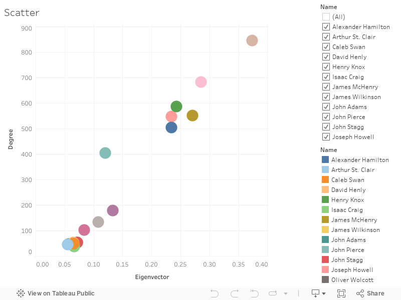
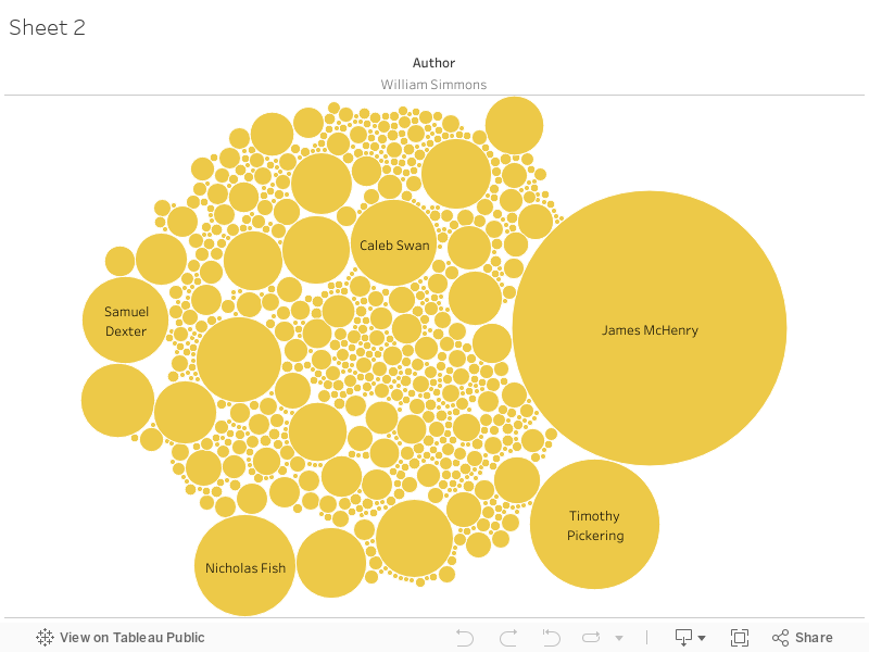

The scatter plot demonstrates the top 20 degree/eigenvector relationships within the network. William Simmons and John Pierce stand out for their high degrees. The extent of William Simmons’ connections are illustrated by the Tableau graph (the one posted is for Authorship; there is another for William Simmons as a recipient, which show who is writing to Simmons and who Simmons is writing to.) The Palladio viz is another way to see Simmons’ connections (with the single and double correspondences filtered out- it looks messy here, but it’s basically unreadable with the 1’s and 2’s- you’re also unable to embed the interactive graph, which is a shame because it’s very fun to throw the data points around.) I would like to examine the amount of correspondence sent by Simmons and Pierce per year (as well as who Pierce was writing to, similar to the graphs above) in Tableau, which will be thrown into dashboards with this information. The overall network viz comes from Gephi but the .png altered the edge thickness- I’d have to use the screenshot and/or install the plugins that allow Gephi to download its data in embeddable formats.
My network code from Colabs is here. What I’m having issues with is Observable- the data here just seems too big. I ran it through Gephi which worked much better, but it lacks the interactivity of the force-directed graphs. I was thinking that I have a few options: 1) Graph it geographically or break it up by year to show the network across the country at the time, 2) Created a graph using the Observable code but only using specific communities found in the network (which I’m not sure how to do) or 3) create the graph using a much smaller set of data based around the female correspondents, which might be too small to form a network. There are other ways I can make it interactive with sliders in Tableau, but I really like how the networks looks. The data itself is just too large, and when I used a .json that only had the community data, it forced Observable into safe mode. I’ll have to research more to see how to change the code to only display what communities I want and/or take a different subset of the data to work with.
2 replies on “Module 10”
When you get a chance, can you post your wardept_nodes and _edges csvs somewhere (github or google), as well as a link to your Observable so I can see what’s going on? I’m not able to get your colabs to run and I’m wondering if there’s a data structure problem somewhere that’s giving you way more nodes/edges than you need and messing up observable.
Breaking it down to female authors and their correspondents, or by year/geography, is possible, but a headache. I’m in the middle of a project doing that with the Founders Online network (networks) and (essay) and the workflow I used to do that was to run a filter for each individual in Gephi or Cytoscape (another networks program, but it’s an even bigger pain in the ass), and then export the edge and node tables for visualization.
Gephi has a plugin for sigmajs, which is another networks visualization library, that can create the files for an interactive network that can be uploaded to github like we did for the basic html assignment. https://blog.miz.space/tutorial/2020/01/05/gephi-tutorial-sigma-js-plugin-publishing-interactive-graph-online/ and https://victorwiard.wordpress.com/2015/01/29/using-sigma-js-to-put-gephi-graphs-and-visualizations-online/ give you an idea of the process. I find sigmajs to be kind of a pita because it can’t do a lot of what d3 does, but networks usually run a bit faster directly on their own browser page than in observable. It may still struggle with that size of network, though, which is why I want to see how your nodes and edges are structured.
For your other visualizations, think about what narrative work your comparisons are doing. Right now, your degree vs eigenvector scatterplot is just showing that people with high degree also have high centrality–is that surprising or interesting in light of other things we know about the network? My gut says no; a comparison between betweenness and eigenvector or degree might tell you more.
The point about Simmons and the accountants/clerks is an interesting one–there might be something worth pursuing there about the growth of the bureaucratic state in the early 19th century.
Let’s maybe touch base on Zoom this week so I can get a better idea of what’s going on with the network size and help you troubleshoot that.
Here is the link to the nodes and edges for the entire dataset: https://docs.google.com/spreadsheets/d/1p4KB8H7h51G3CsPyXwiAGEzIHa5ETVXPcsmP8djiMoQ/edit?usp=sharing
By taking out the duplicate nodes, I was still left with over 2,000 nodes and their edges to deal with. When I was trying to get a feel for the breadth of the Simmons network in Palladio, I threw out the single correspondences, but I’m not sure if that would do much good here because it’s just generally huge- unless I’m totally wrong with the nodes/edges and it’s actually not supposed to be like this. Putting the whole dataset into Observable does this: https://observablehq.com/d/4987acdc4fda4399.
Here’s the notebook for correspondence isolated within 1789: https://observablehq.com/d/7ee4c389b086d862. From 1791-1800, that’s when the correspondence starts getting into the thousands (7,036 individual correspondences at the peak) which is what seems to give Observable trouble. (Also, I’m pretty sure that Observable just wasn’t running because of something I did trying to either a) isolate the communities or b) change the size of the nodes, so that’s probably on me.) So it definitely works, which makes me think it’s more of a network-size thing than anything else. I think I was trying to do something similar to your Founders Network with my Simmons authorship/recipient plots in Tableau, but I ended up just using Excel to determine the frequency of each relationship and sized the data points that way. Maybe it’s just because I chose individuals who had too much correspondence and make it difficult to see anything else?
Mapping by women’s correspondence without doing anything to the data looks like this: https://observablehq.com/d/3a7d31c1271c3040. Not a whole lot has been recovered during this project even though there is undoubtedly much more that was lost in the fire in terms of their husband’s pay/individual settlements and aid/etc.
So that’s where I’m at with my Observable notebooks and the various iterations of the nodes and edges in this network! If the problem is just with the proportions of the network, does that have a fix in Observable? And if it’s actually a problem that I’ve caused, hopefully there’s a fix for that as well! I’ll schedule a meeting for later this week once I get a few other things in order.