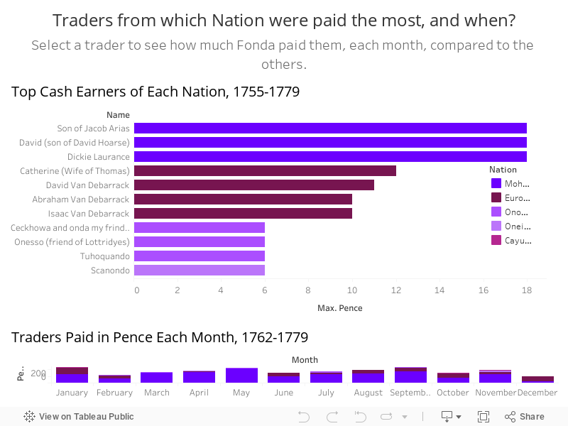
This week I worked on interactivity. I created a dashboard combining my bar charts, added filters, and wrote annotations on the rest of my charts. The previous bar charts I posted using the Wendell dataset were misleading because I implied that “Trading by Month” included all trading that occurred between Wendell and his business partners, but I was actually only displaying exchanges that involved payment in pence. Same with “Top Earners for Each Nation”. These were not the top earners, only the top cash earners. I fixed my titles to make this clearer.
I cleaned up these visualizations by grouping categorical variables together, adding years so the reader knows the time frame each chart refers to, and creating my own color palette.
Although I did not add my text here (it would have been way too many paragraphs), I did spend this week working a lot more on my StoryMap outline. I finalized my argument and the sources I will be citing throughout the StoryMap, and wrote short paragraphs to discuss each visualization using both outside information from secondary sources and my own inferences about the data. The only thing remaining is to put it all together in my StoryMap, and also to finalize the images I will be adding. I have a few handy, but I think I want to spend the next few days finding some better ones.
I plan on practicing my presentation talk this weekend. So far, I don’t have much of a script drafted. I have a tendency to over-talk, so I need to narrow down my main points so I stay within the 7-10 minute time frame. I plan on using Zoom, as I’m most familiar with that recording feature.
One reply on “12: Work”
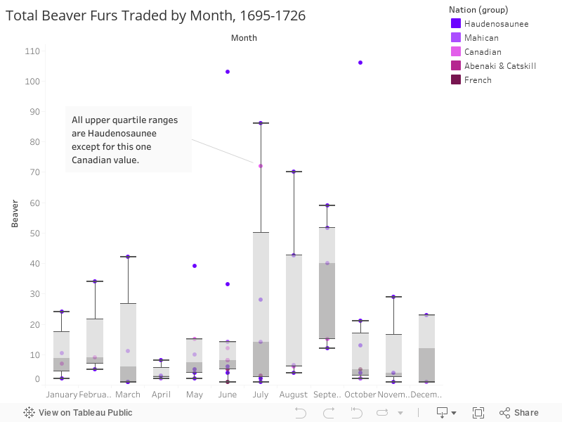
The color scales are much easier to tell apart here. If you want to fiddle with them further, I’d tone down the saturation of some of the more pinks, but I don’t think that’s necessary. One small thing is that your most-red value in most places is for French or Europeans, but in the very first chart, the Europeans are in the same purple range as Haudenosaunee nations and the Cayuga are the most-red value. You can manually assign colors in Tableau by clicking the little Color pane in the Marks card.
The box plot looks great, that’s much clearer to read.
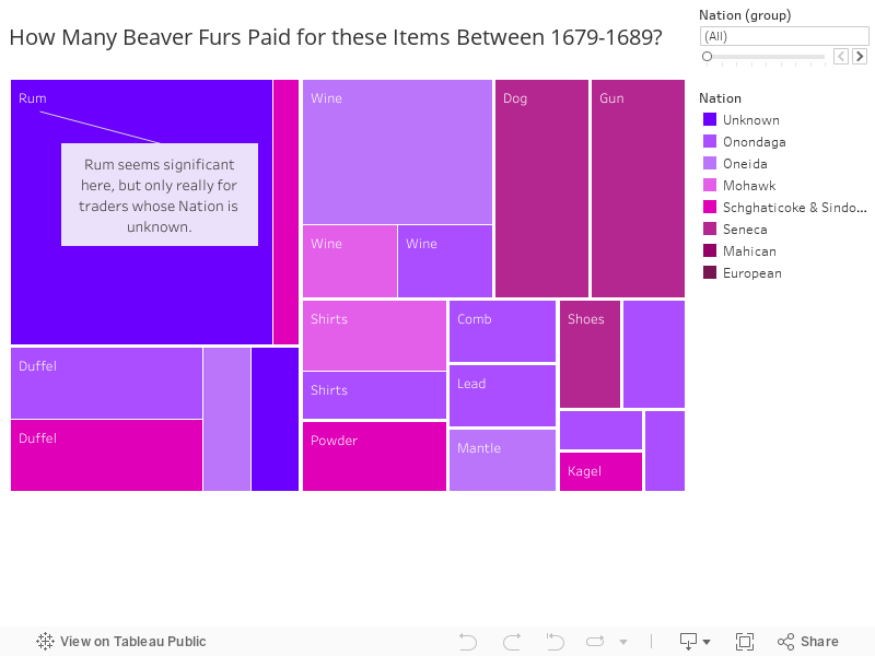
In your treemap at the bottom, you’re not actually looking at frequency, which would be number of times an item was purchased, you’re looking at total beaver paid for that item by nation. I downloaded your workbook to check, and if you add CNT(Beaver) to your treemap (the count of transactions that used beaver), the Wine item that you have annotated is only 1 transaction. Likewise, almost everything else is 1 or 2 transactions. I think in that one you’ve got mixed up a couple of different questions: are you asking 1. how often an item was bought by people from each nation? 2. how much on average someone from each nation paid in beaver for each item? or 3. how much total people from each nation spent on each kind of item? Because those are all three separate questions, and right now you’re showing the answer to #3 but saying you’re asking #1.