
<script type='text/javascript'> var divElement = document.getElementById('viz1615684767664'); var vizElement = divElement.getElementsByTagName('object')[0]; vizElement.style.width='1016px';vizElement.style.height='991px'; var scriptElement = document.createElement('script'); scriptElement.src = 'https://public.tableau.com/javascripts/api/viz_v1.js'; vizElement.parentNode.insertBefore(scriptElement, vizElement); </script>For the side-by-side bar chart I created a chart which tracks the population of Albany in each Census year, broken down by race. I included a filter for race.
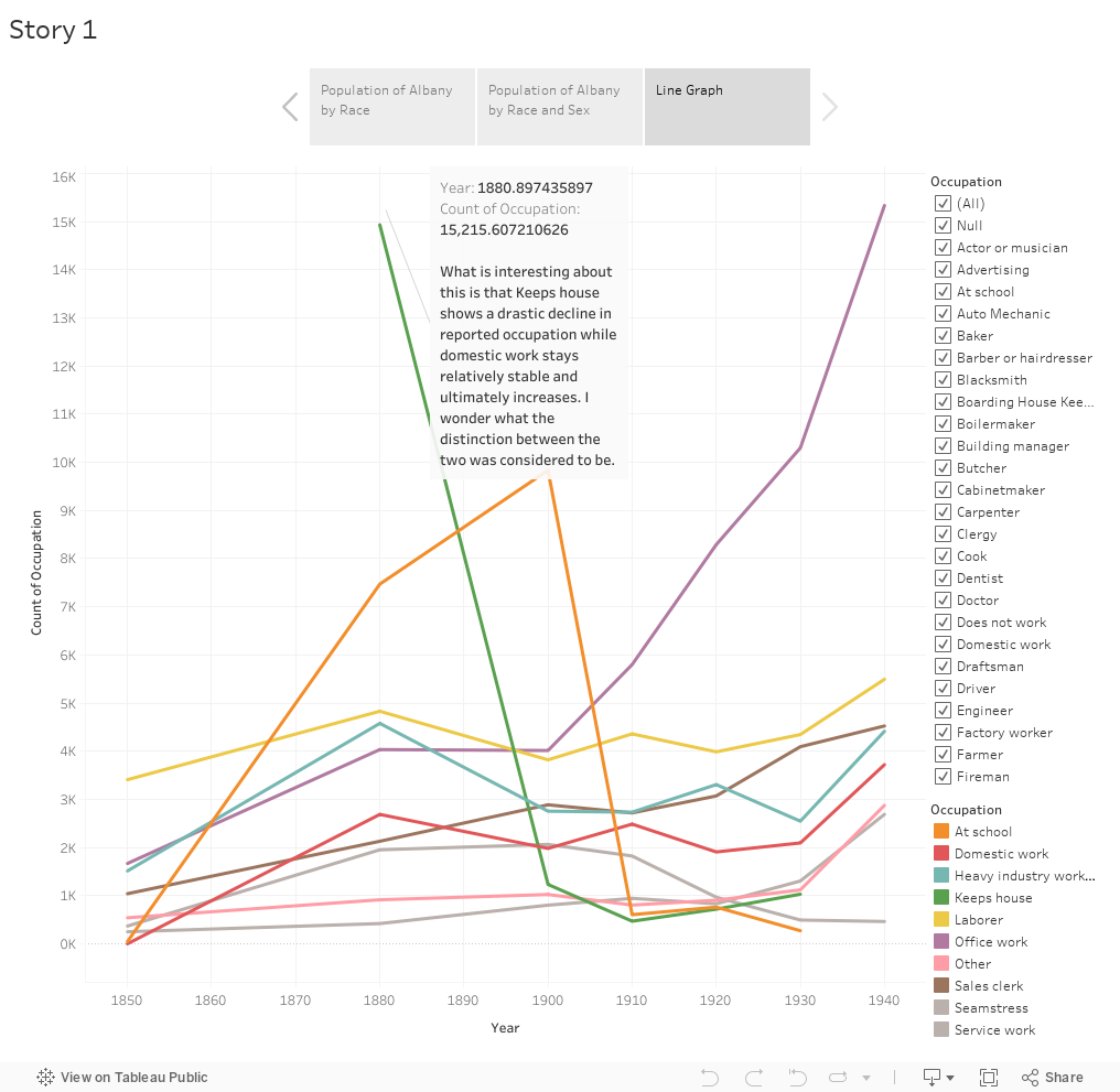
<script type='text/javascript'> var divElement = document.getElementById('viz1615685156434'); var vizElement = divElement.getElementsByTagName('object')[0]; vizElement.style.width='1016px';vizElement.style.height='991px'; var scriptElement = document.createElement('script'); scriptElement.src = 'https://public.tableau.com/javascripts/api/viz_v1.js'; vizElement.parentNode.insertBefore(scriptElement, vizElement); </script>For the line graph I created a graph which charts the top 10 most popular occupations in Albany from 1850-1940 based on the census data. This map is colored with each occupation’s line having a different color. There is a filter to exclude occupations should the viewer choose.

<script type='text/javascript'> var divElement = document.getElementById('viz1615685383346'); var vizElement = divElement.getElementsByTagName('object')[0]; vizElement.style.width='1016px';vizElement.style.height='991px'; var scriptElement = document.createElement('script'); scriptElement.src = 'https://public.tableau.com/javascripts/api/viz_v1.js'; vizElement.parentNode.insertBefore(scriptElement, vizElement); </script>For the dot graph I created a graph which which tracks the population of Albany in each Census year, broken down by race and gender. So, the two broad categories are Male and Female.
Reflection
I really enjoyed this week’s assignment. I think it has been my favorite one so far. The process of creating my own graphs was really cool because I had to figure out what I wanted to graph, what options would best reflect that and show what I was hoping to, and whether colors would be necessary. It was also cool to see what didn’t translate as well as I hoped, and perhaps became a jumbled mess. I also enjoyed making purposefully bad charts with misleading data.
The HTML/CSS assignment was also really cool. I’ve enjoyed most of these assignments even though at times actually doing them has been slightly frustrating. The potential of what can be done with each, and also by combining them is very exciting.