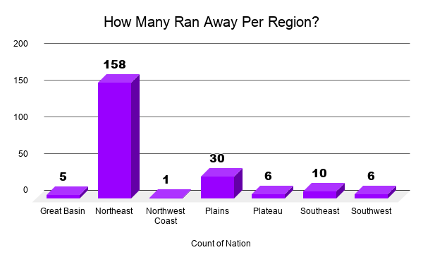
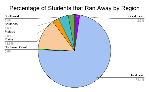
These are two more visualizations I’m planning to use for my project, in addition to two tableau public visualizations. Although they are static charts, I believe they help my project. The bar graph shows how many students from each region ran away and the pie chart shows the percentage of total students that ran away by region. I had to go through and clean the data so I had a sheet of only the kids who ran away and not every cause of leaving. I am also attaching the Tableau Public visualizations below.
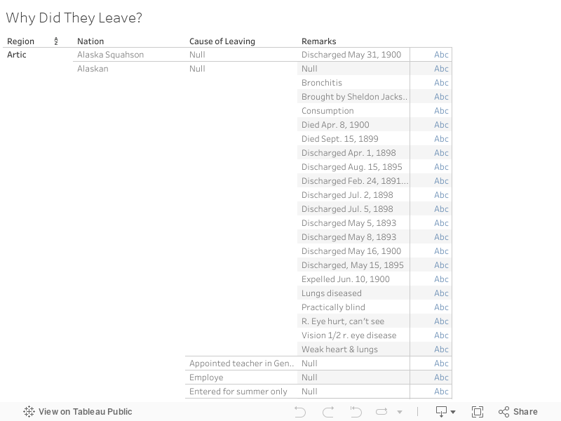
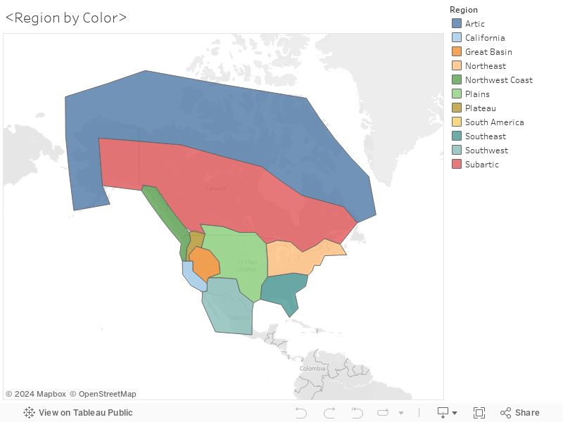
The first graphic shows all the causes of leaving, also by region and tribe. The second graphic colorizes the region so it is easier to see the regions in relation to the schools location.
2 replies on “Module 12 check in”
As a general rule, don’t use 3D anything–it’s very visually confusing because it makes 6 look nearly as big as 10 (for example).
As I mentioned in my last comment, your next step should be to group together some of the causes for leaving so that you can see if there are trends by region. If you’re feeling pressed for time, you can do this just for the Northeast since that’s the majority and Carlisle itself is in the Northeast, so presumably it’s closer to home for most of those students. Grouping the “Cause of Leaving” column in Tableau would help you see if proximity to home really is what made those students more likely to leave.
My project was to look at if students were more likely to run away if they were from a region closer to the school, would I still have group all the other causes of leaving? I was going to use my first graph (turning it back into 2D) to show that a higher number of students ran away when they were from the region the school was in.