Alright, after a bit of a mess last week, I think I’ve sorted myself out. Here’s a demo example of the WordPress theme that I’m going to adapt for my final product — I think it’s going to come out pretty cool. Readers will be able to scroll horizontally through the decades, journeying from modern food fads and restaurant trends all the way back to the bizarre and unappealing dishes that were popular in the 1850s.
Since I’ve changed my methodology, I’ve decided to use the full menu dataset, so that means no geographic restrictions and a lot more data to explore. I’m doing all of my analysis in R, which will speed up the process and also keep my computer from freezing up whenever I try to manipulate any data. I’ll also be integrating data scraped from Twitter and the NY Times.
This is certainly not set in stone, but my rough outline of the ‘slides’ the project website will scroll through is as follows:
- Homepage: Providing some background / context for the project, describing what exactly it is I mean by ‘food fad’, briefly describing the data, etc
- Modern Trends:
- Avocado toast, kale salad, seltzer, fermenting, and so on…. Using text search in R to see when and where various food trends of the past decade were first referenced in the menu collection and pairing this with some Twitter and NY Times data.
- Looking at what food items were listed most frequently on menus in the past ten years. Do they match the Buzzfeed listicles of fad foods, or were actual restaurant menus featuring less cronuts and quinoa than we would think?
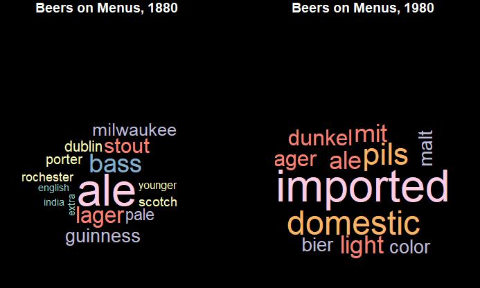
- A Craft Beer Interlude:
- Craft beer became ubiquitous in the 2000s & 2010s. I’m going to look at beer brands and styles as they appear in the historical menu collection, and zoom in on a few breweries and styles that have come in and out of fashion.
- Trends by Decade
- A similar analysis as above, looking at various foods we associate with each decade and when/where they appeared in the historic menus, as well as what words/foods are referenced most in each menu. I’ll probably go back to around ~1950 in this section
- A Coffee Interlude
- A similar tangent to the beer interlude, this time looking at coffee: national origins and preparation styles. I’m thinking in the context of the “latte liberal” rhetoric of the late ’90s/early naughts
- 19th & 20th Century Oddities
- In 1890, basically every menu contained some sort of turtle concoction and a pigeon cooked in butter with a fancy French name. I’ll look into what foods were very popular on long-ago menus and chart their decline.
I’m trying to figure out how to code a search for any word that rises quickly in prominence and then falls — I once saw a blog post where someone did a similar analysis with baby names (here) that I’m going to read closely for some analytical inspiration.
Here are some not-very-exciting and very preliminary visualizations!
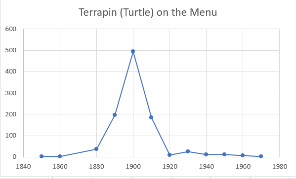
Making quick line charts like the turtle one above, I think I found a data issue… every menu item spikes in frequency in 1900. I think there must be an issue with the dates — either a lot of menus that aren’t from 1900 are misclassified, or, for some reason, the menu archive has a disproportionate amount of menus from that year. I’ll investigate tomorrow!
One reply on “Module 10 Update (but actually week 12…)”
This is looking really good, I’m excited to see how this comes out. As a presentation note, make sure to note really clearly that it’s necessary to click through sideways on that theme; at least on the demo page I was confused for a moment because it seemed like scrolling down or sideways was changing the photos on the splashpage because they just change on their own.
The beer word clouds are a nice addition, and I usually steer people away from wordclouds because they sometimes don’t show much. There’s a tipping point in the 1870s/1880s when Albany specifically loses its prominence as an ale manufacturing hub to lager producers in Chicago, so it would be interesting to see the decades to either side of 1880.
For the babynames % change, I don’t know the exact syntax in R, but in Python I’d make a dataframe of dish appearances by year, and add a new calculated column for the percent of all dishes for that year, which looks like what is being charted in the last three charts. Then add another calculated column with % change from the previous year to find the big increase/decreases and sort.
For the 1900 menus, try spot checking some of the scans. I wouldn’t be surprised if it’s an OCR error, but I also wouldn’t be surprised if they just have a ton of menus from 1900 since that’s when the collection began http://menus.nypl.org/about