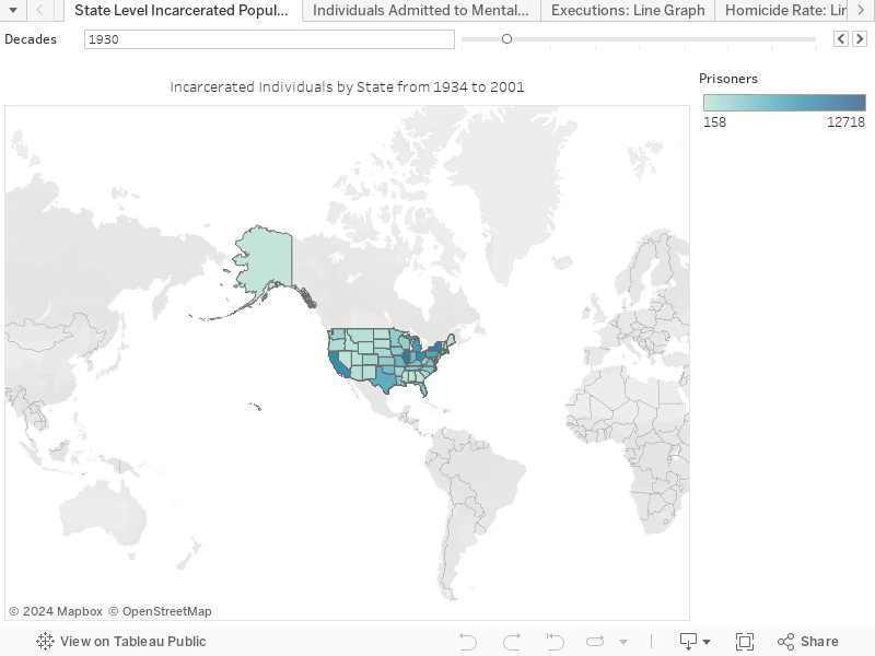
<script type='text/javascript'> var divElement = document.getElementById('viz1618523995232'); var vizElement = divElement.getElementsByTagName('object')[0]; vizElement.style.width='100%';vizElement.style.height=(divElement.offsetWidth*0.75)+'px'; var scriptElement = document.createElement('script'); scriptElement.src = 'https://public.tableau.com/javascripts/api/viz_v1.js'; vizElement.parentNode.insertBefore(scriptElement, vizElement); </script>For my first choropleth map, I compared the number of incarcerated individuals to the total state population. I also included a slider to filter by year so viewers can observe national trends in incarceration rates across the 20th century.

<script type='text/javascript'> var divElement = document.getElementById('viz1618524244881'); var vizElement = divElement.getElementsByTagName('object')[0]; vizElement.style.width='100%';vizElement.style.height=(divElement.offsetWidth*0.75)+'px'; var scriptElement = document.createElement('script'); scriptElement.src = 'https://public.tableau.com/javascripts/api/viz_v1.js'; vizElement.parentNode.insertBefore(scriptElement, vizElement); </script>Similar to my first choropleth map, the second choropleth map compares the number of individuals admitted to mental health facilities to the total state population. Here I also included a slider to filter by years so viewers can observe national trends across the 20th century.
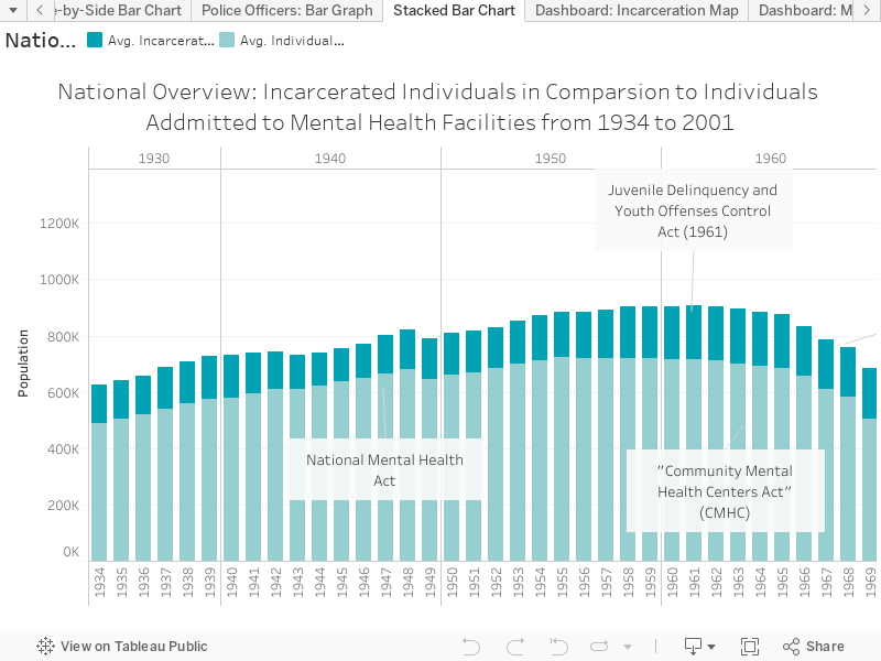
<script type='text/javascript'> var divElement = document.getElementById('viz1618524291745'); var vizElement = divElement.getElementsByTagName('object')[0]; vizElement.style.width='100%';vizElement.style.height=(divElement.offsetWidth*0.75)+'px'; var scriptElement = document.createElement('script'); scriptElement.src = 'https://public.tableau.com/javascripts/api/viz_v1.js'; vizElement.parentNode.insertBefore(scriptElement, vizElement); </script>Conversely, the stacked bar chart uses national statistics to compare the number of incarcerated individuals to the number of individuals admitted to mental health facilities from 1934 to 2001. The bar chart illustrates a drastic increase in incarceration in the 1970s, which aligns with the periodization presented in histories of mass incarceration. However, I am going to have to go back and re-read the final report to see who the researchers are counting when collecting statistics on individuals in mental health facilities. Are the records solely counting court-ordered admittance to mental health facilities? Or are the numbers reflective of the entire population? Nevertheless, I plan on doing some reading on mental health in the United States during the 1970s to be able to contextualize the data.

3 replies on “10: Work”
Sketch looks good 🙂
Can you drop in a direct link to your Tableau? I’m trying to figure out why the embeds are still working like crap. Right now it looks like your maps are displaying the absolute incarcerated/hospitalized population, rather than incarcerated population per 100k of total population, which is what it sounds like you’re trying to do.
As far as the eventual dashboard, this looks like a good candidate for a dashboard with linked actions. ie, you could have a single filter that advances the year for both your maps on the dashboard to make it easier to compare the incarcerated vs hospitalized population, and clicking a state on the map could show a bar chart showing that state’s incarcerated and hospitalized populations over time.
Are you planning on doing anything with the unemployment and poverty rates? You can have multiple dashboards and carry over a common map or other visualization between them–like have Dash1 a comparison of incarcerated vs hospitalized pop; Dash2 a comparison of hospitalized pop, poverty, and unemployment; and Dash3 a comparison of incarcerated, poverty, and unemployment, etc.
Good afternoon Dr. Kane,
Sorry for the delayed response, here is the link to my Tableau:
https://public.tableau.com/profile/kaycie.haller#!/vizhome/DraftFinalProject/StackedBarChart
Please let me know if you have any other questions. Also thank you for the suggestions! They help a ton.
Happy Monday!
Kaycie
Wow, that shift from hospitalization to incarceration is really stark on the overview chart.
I pulled your tableau workbook to play with and I think there’s something off about your numbers–your total incarcerated pop is sometimes much, much larger than the state population. Let’s try to figure that out when we meet today.