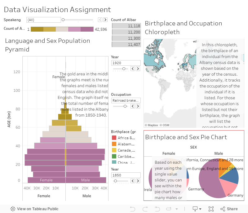
https://public.tableau.com/profile/joni5577#!/vizhome/Week5AssignmentDataVisualization/Dashboard1 Unfortunately, the Tableau Public site is down so I can’t embed my dashboard, but this is the link to my workbook and the dashboard I created. I provided a screenshot as well, just in case the link does not work. 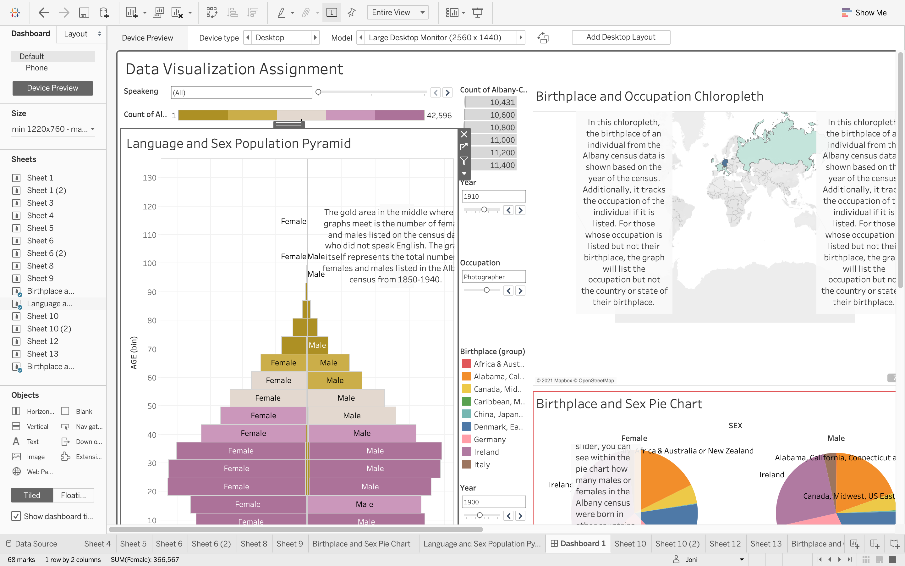
var divElement = document.getElementById(‘viz1617816906520’); var vizElement = divElement.getElementsByTagName(‘object’)[0]; if ( divElement.offsetWidth > 800 ) { vizElement.style.minWidth=’420px’;vizElement.style.maxWidth=’850px’;vizElement.style.width=’100%’;vizElement.style.minHeight=’687px’;vizElement.style.maxHeight=’887px’;vizElement.style.height=(divElement.offsetWidth*0.75)+’px’;} else if ( divElement.offsetWidth > 500 ) { vizElement.style.minWidth=’420px’;vizElement.style.maxWidth=’850px’;vizElement.style.width=’100%’;vizElement.style.minHeight=’687px’;vizElement.style.maxHeight=’887px’;vizElement.style.height=(divElement.offsetWidth*0.75)+’px’;} else { vizElement.style.width=’100%’;vizElement.style.height=’1477px’;} var scriptElement = document.createElement(‘script’); scriptElement.src = ‘https://public.tableau.com/javascripts/api/viz_v1.js’; vizElement.parentNode.insertBefore(scriptElement, vizElement);
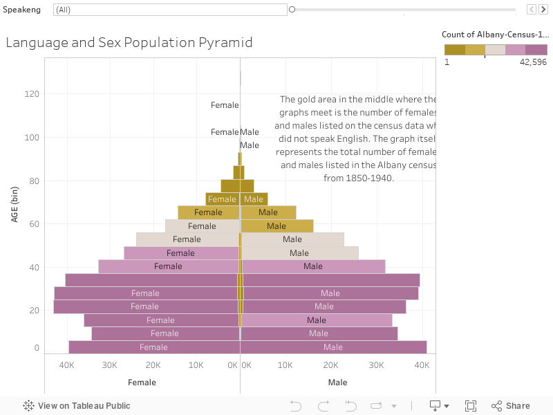
In the first diagram, I created a population pyramid that tracks the total number of males and females within the census data by age group. I then added a language filter to determine how many of each group did not speak English according to the census data.
var divElement = document.getElementById(‘viz1617817244251’); var vizElement = divElement.getElementsByTagName(‘object’)[0]; vizElement.style.width=’100%’;vizElement.style.height=(divElement.offsetWidth*0.75)+’px’; var scriptElement = document.createElement(‘script’); scriptElement.src = ‘https://public.tableau.com/javascripts/api/viz_v1.js’; vizElement.parentNode.insertBefore(scriptElement, vizElement);
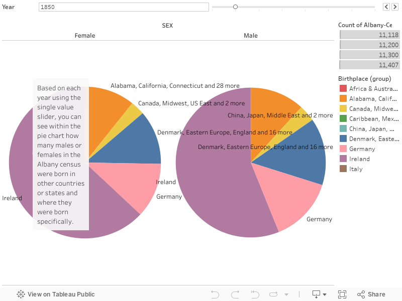
For the second diagram I created a pie chart to look at gender and birthplace. The pie chart displays the amount of males and females listed in the Albany census and their country or state of origin. There is also a “year” filter on the diagram to track the shifting numbers of males and females from each place over the years.
var divElement = document.getElementById(‘viz1617817086158’); var vizElement = divElement.getElementsByTagName(‘object’)[0]; vizElement.style.width=’100%’;vizElement.style.height=(divElement.offsetWidth*0.75)+’px’; var scriptElement = document.createElement(‘script’); scriptElement.src = ‘https://public.tableau.com/javascripts/api/viz_v1.js’; vizElement.parentNode.insertBefore(scriptElement, vizElement);
For the last diagram I created a chloropleth to demonstrate on a geographical map the birthplace of individuals as well as their occupations. I added a “year” filter as well to track which occupations were most common over the years in each country or state of origin for the people listed in the Albany census.
var divElement = document.getElementById(‘viz1617819249533’); var vizElement = divElement.getElementsByTagName(‘object’)[0]; vizElement.style.width=’100%’;vizElement.style.height=(divElement.offsetWidth*0.75)+’px’; var scriptElement = document.createElement(‘script’); scriptElement.src = ‘https://public.tableau.com/javascripts/api/viz_v1.js’; vizElement.parentNode.insertBefore(scriptElement, vizElement);
I really enjoyed this Tableau assignment, even though it took me a while to get the hang of applying filters and figuring out how to edit them. The fact that I could click, drag, and right click functions to edit them instead of writing code for everything was much easier for me. I think presenting census data in such a way can help viewers interact with and understand large data sets like these much easier.