Here is the link to my Tableau Public account in case the story does not allow you to click through the visuals.
<script type='text/javascript'> var divElement = document.getElementById('viz1616218492793'); var vizElement = divElement.getElementsByTagName('object')[0]; vizElement.style.width='1016px';vizElement.style.height='991px'; var scriptElement = document.createElement('script'); scriptElement.src = 'https://public.tableau.com/javascripts/api/viz_v1.js'; vizElement.parentNode.insertBefore(scriptElement, vizElement); </script>I focused the fist two visuals on Irish immigration and the third one gender and occupation.
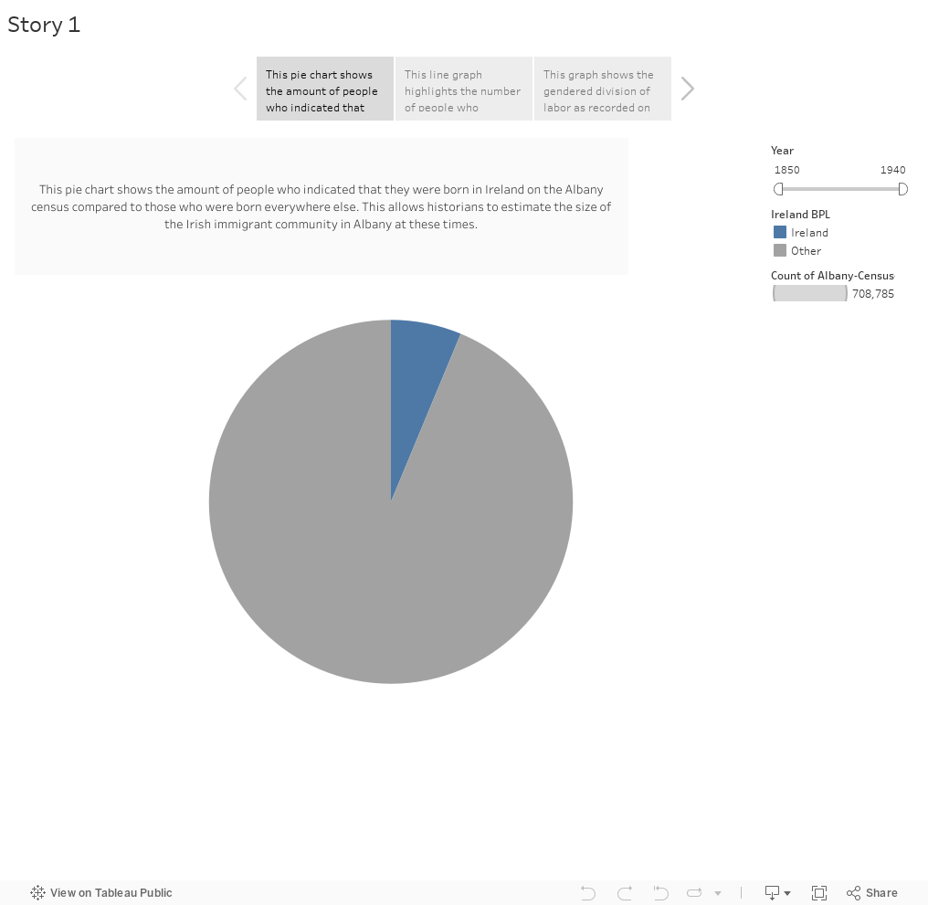
Visual 1: This pie chart shows the amount of people who indicated that they were born in Ireland on the Albany census compared to those who were born everywhere else. This allows historians to estimate the size of the Irish immigrant community in Albany at these times.
Visual 2: This line graph highlights the number of people who indicated that they were born in Ireland on the Albany census. This graph shows how the numbers decreased over the years, however it is important to note that this is just showing those born in Ireland and is not indicative of a decrease of the Irish population in Albany, only a decrease in first-generation immigrants.
Visual 3: This graph shows the gendered division of labor as recorded on the census records. I excluded the Null category as it made all of the other data appear disproportionate. With the year filter on the right, the graph shows how the gender distribution of the workforce changed over time by occupation. However it is important to note that there are limitations to the visualization. The graph does not show if more women joined the workforce because of a cultural shift or if there was an increase in female laborers immigrating/migrating to Albany.
Out of all our assignments thus far, I have enjoyed the HTML/CSS assignment, the data cleaning assignment, and the data critique assignment the most. I was surprised that I enjoyed the HTML assignment, but after doing the javascript and python assignments – HTML is great. I would pick a 1990’s webpage over working with javascript or python in a heartbeat. I also enjoyed the data cleaning and critique because of how detailed oriented they were. I enjoy the methodic, organization side of data.