One of the main challenges with this data set was that each woman had multiple entries in the data. Consequently, it would say there were 200 women working as librarians, but really it was only 7 with multiple entries. To get around this, I did a unique filter on the spreadsheet and created a filtered data set where each Identification Number only had one entry listed. This way, each woman’s occupation and employment status was only counted once. I realized that this would not work for the visualizations looking at hours worked because each individual entry mattered – so those visualizations are using the data set with each individual entry.
I chose to keep the automatic blue-toned color scheme because that is what looked the cleanest to me.
I am going to focus my analysis through the lens of employment as opposed to housework.

This map shows the amount of women per state that were included in data collection.
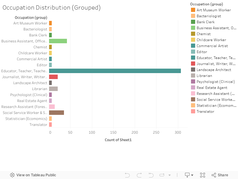
Here is an updated breakdown of the occupations recorded, I grouped together occupations related to teaching and education, secretaries and other clerical work, and social service workers and social workers.
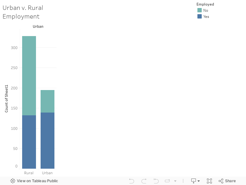
This visualization is a quick comparison between rural and urban employment rates.
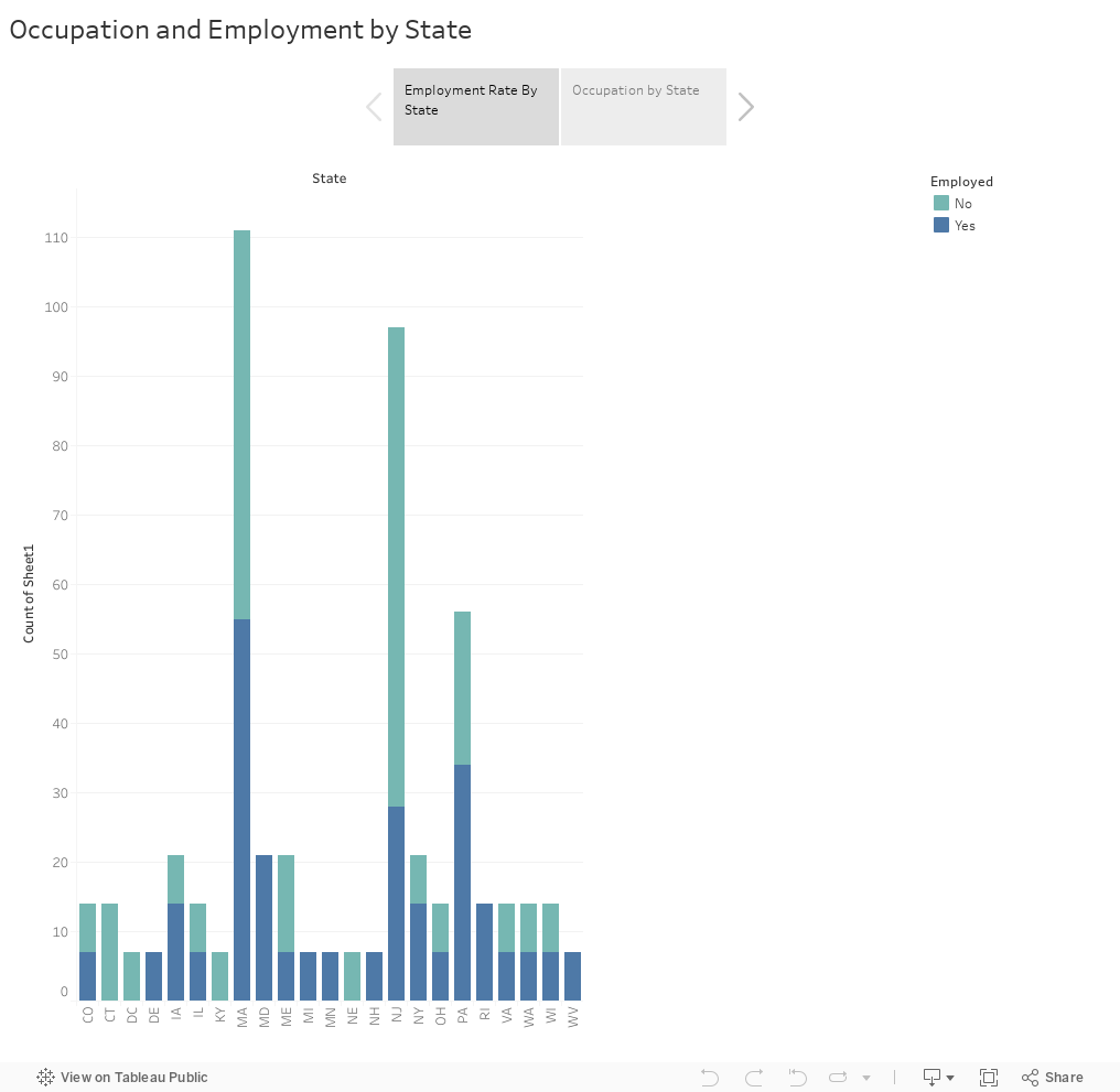
This story shows the employment rate and occupation distribution by state.

I also simplified the treemap to be sorted by decade on the Age Distribution Story.
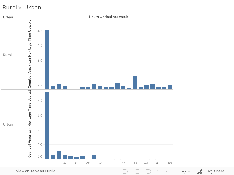
Lastly, I am including the comparison between urban and rural hours worked.
As of Week 12, my to-do list included finishing up my research on women’s daily lives and employment in the Great Depression, collecting sources that focus on both urban and rural areas, and solidifying my argument/analysis. I also want to clean up the visualizations a little bit for the final version.